
In the first post we've already discussed the objective, as well as basics, or strategy, of how to create fully functional React templates (with props, events handling etc.) and dynamically load them using new SharePoint Framework project type - Library Component.
This post covers implementation details: main web part, dynamic template factory loading, and library component with alternative UI.
If you don't want to read the post - the code is available here. Feel free to use it in any way you want.
Previous post - Basics
Web Part
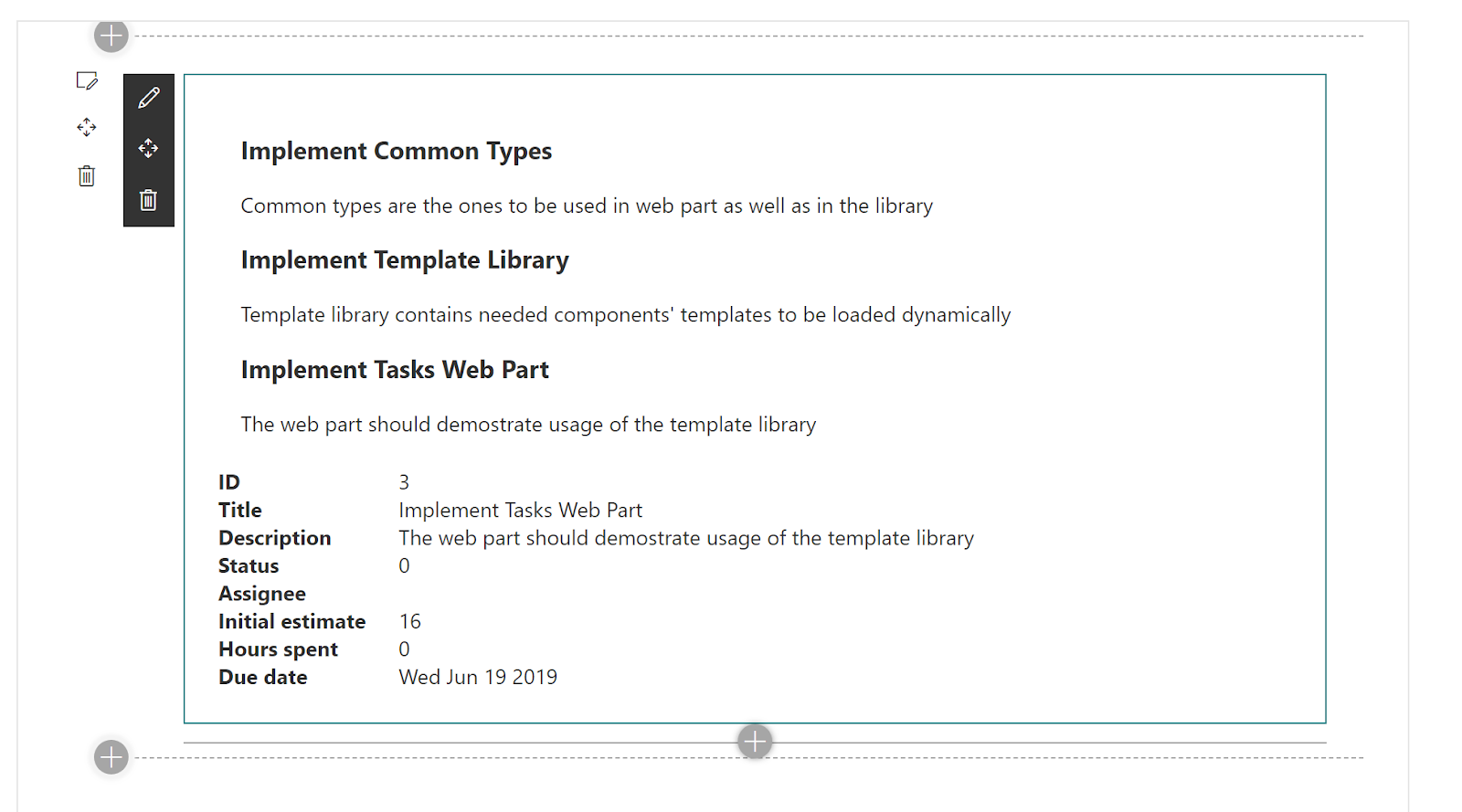
As mentioned in the previous post, we'll be creating 2 different UIs for Tasks list.The default one, implemented as part of client side web part, will look like that:
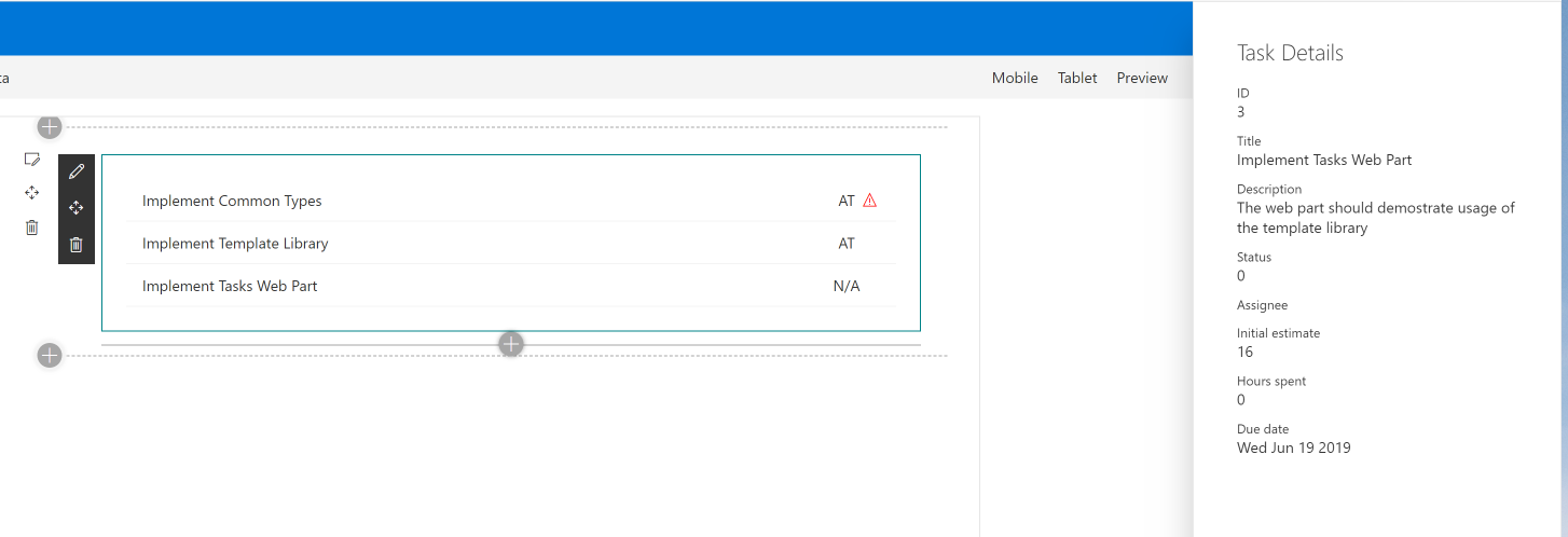
And alternative one, implemented as a separate Library Component:
Initial Preparation
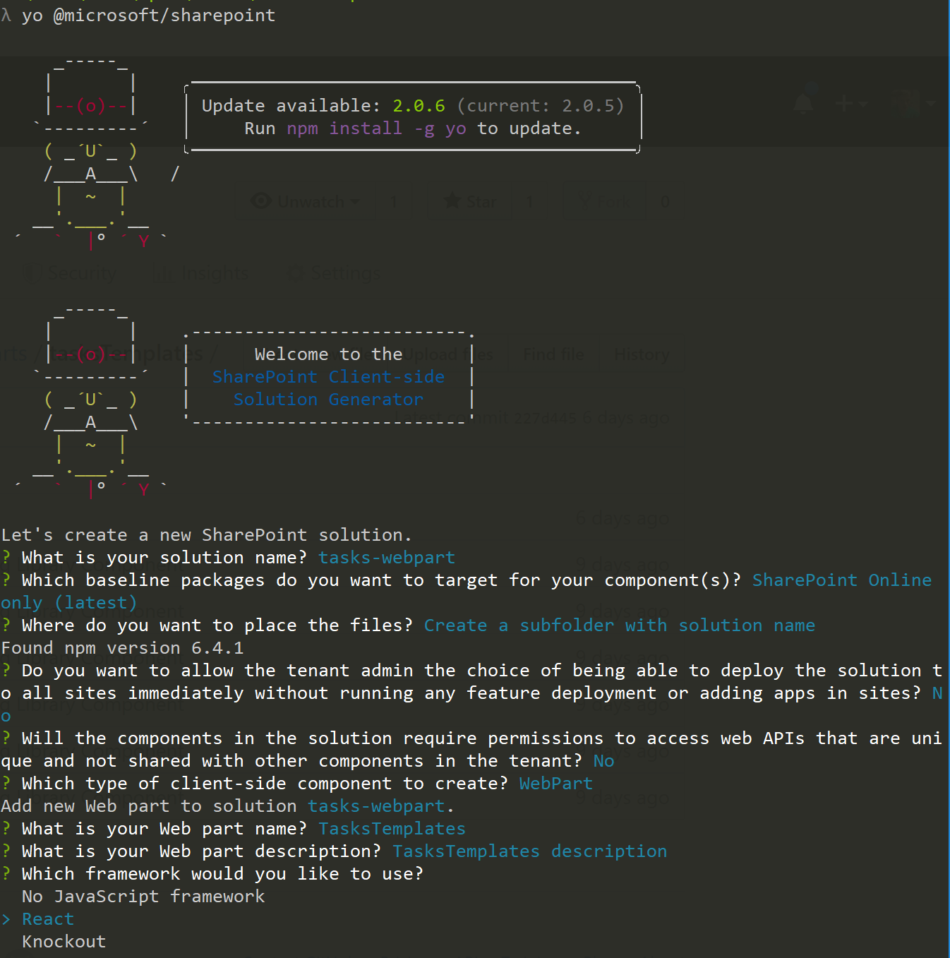
And let's start with the web part implementation.As a template we'll use Web Part with React Framework.
Contracts
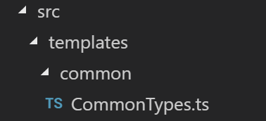
As mentioned in the first post, there are "contracts" that must be used in all implementations of components. And in this solution all of them are defined in CommonTypes.ts file that should be copied in the projects. So, let's create common folder in web part's code directory and copy the file there.Now we have interfaces for templates factory, as well as for all dynamic React components: Tasks List, Task, and Task Details.
Web Part's Main Component
Now let's modify web part's main component (in this example - TasksTemplates) to render what we really need instead of default "Learn more" UI.At this point of time we know that there is some ITemplateFactory interface with getTemplateComponent method. We don't know (yet) how to instantiate it, but we can use the interface definition to dynamically get needed templates and render them in TasksTemplates component.
So, first, let's update ITasksTemplatesProps to expect templates factory as well as list of tasks to be rendered:
import { ITemplateFactory, ITask } from '../../common/CommonTypes';

/**
 * Main web part component props
 */
export interface ITasksTemplatesProps {
  /**
   * Selected template factory
   */
  templateFactory: ITemplateFactory;
  /**
   * Tasks to render
   */
  tasks: ITask[];
}export interface ITaskTemplatesState {
selectedTask?: ITask;
}public render(): React.ReactElement<ITasksTemplatesProps> {
const {
tasks,
templateFactory
} = this.props;
const {
selectedTask
} = this.state;
//
// Any capitalized variable can be used as a React component in .tsx (.jsx) files.
// We're getting the templates (React components) from template factory to use them in the markup
//
const TaskList = templateFactory.getTemplateComponent('task-list') as React.ComponentClass<ITaskListProps>;
const Task = templateFactory.getTemplateComponent('task') as React.ComponentClass<ITaskProps>;
const TaskDetails = templateFactory.getTemplateComponent('task-details') as React.ComponentClass<ITaskDetailsProps>;
return (
<div className={styles.tasksTemplates}>
<TaskList strings={strings} tasks={tasks} taskTemplate={Task} onTaskSelected={task => {
this.setState({
selectedTask: task
});
}} />
{selectedTask && <TaskDetails {...selectedTask} strings={strings} />}
</div>
);
}Two additional interesting things to mention.
First, when getting templates from the factory we're casting them to React.ComponentClass<IProps>. It allows us to use TypeScript's type checking for dynamic component's props.
Second, TaskList component has a property taskTemplate: React.ComponentClass<ITaskProps>. And using such a property we can pass one template to another. So, if needed, we can even combine templates from different sources and pass them one to another.
TaskList, Task, TaskDetails - Default Implementation
Next step is to implement default templates for TaskList,Task and TaskDetails components.There is nothing interesting in Task and TaskDetails implementations. You can find them in GitHub repo for the solution.
But let's look at TaskList implementation. As shown above, one of the properties for the list is taskTempalte that contains a component to render each task in the list.
To use it we need to apply the same approach as in TasksTemplates component - we'll get the value from props and store it in capitalized variable:
public render(): React.ReactElement<ITaskListProps> {
    const {
      tasks,
      taskTemplate,
      onTaskSelected,
      strings
    } = this.props;

    // any capitalized variable can be used and React element
    const TaskTemplate = taskTemplate;

    return (
      <div className={styles.taskList}>
        {tasks.map(t => {
          return <TaskTemplate {...t} strings={strings} onSelected={() =gt; { onTaskSelected(t); }} />;
        })}
      </div>
    );
}Now, let's implement default templates factory that will work with the components mentioned above:
import * as React from 'react';
import { ITemplateFactory, TemplateType } from './common/CommonTypes';
import { Task } from './components/task/Task';
import { TaskDetails } from './components/taskDetails/TaskDetails';
import { TaskList } from './components/taskList/TaskList';

/**
 * Default template factory
 */
export class DefaultTemplateFactory implements ITemplateFactory {
  public getTemplateComponent(templateType: TemplateType): React.ComponentClass<any> | null {
    switch (templateType) {
      case 'task':
        return Task;
      case 'task-details':
        return TaskDetails;
      case 'task-list':
        return TaskList;
    }
  }
}
Library Component with Alternative Templates
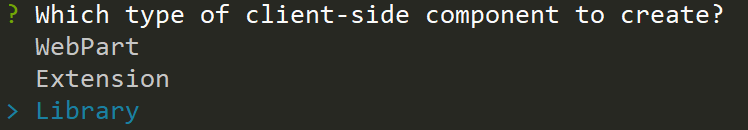
Library Component is a new type of SPFx project that is GAd in version 1.9.0. It allows developers to create some "shared" code that is deployed to App Catalog and referenced by other SPFx components (Web Parts, Extensions, and even other Library Components).If you run SPFx Yeoman generator version 1.9.0 or higher, you'll see a new option - Library.
This option will generate new SPFx project with a well-know structure - same as for web parts and extensions.
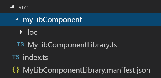
The main differences here is not empty index.ts file in the root of src folder. In case of Library Component it actually shows what will be exported from the library. In default implementations it's a class with a single property called name to return library's name:
export default class TemplatesLibrary {
  public name(): string {
    return 'MyLibComponentLibrary';
  }
}First, similarly to web part, we need to copy our "contracts" - CommonTypes.ts to the project. And, again, I'll copy it in common folder.
Next - implement all used components - TaskList,Task and TaskDetails. The implementation is pretty standard so no need to post it here. The only thing to mention - by default Library Component project doesn't reference React library. So, for our implementation we'll need to install additional modules:
npm i --save --save-exact @types/react@16.4.2 @types/react-dom@16.0.5 react@16.7.0 react-dom@16.7.0 office-ui-fabric-react@5.132.0/**
* Default export from the SPFx Library Component is a template factory
*/
export default class TemplatesLibrary implements ITemplateFactory {
public getTemplateComponent(templateType: TemplateType): React.ComponentClass<any> | null {
switch (templateType) {
case 'task':
return Task;
case 'task-details':
return TaskDetails;
case 'task-list':
return TaskList;
}
}
}Now we can package Library Component solution, deploy it to App Catalog and make it available for other SPFx solutions in the tenant.
Secret Ingredient: SPComponentLoader
Now we have the web part, we have default UI for our Tasks list, we have a separate library with alternative UI. But how will we select the appropriate templates factory and load templates?The answer is simple - SPComponentLoader. (Unfortunately, class definition was removed from the documentation for some reason. But you can find some mentions of it here, here, here and here. There is also a separate NPM package for the loader sp-loader). We can use this class to either load any JavaScript file, or load an SPFx component by its ID. The latter is exactly what we can use for Library Components as they're still SPFx components with defined ID.
For that purposes let's define a componentId property in our web part. If the property is set then we'll load the component by ID using SPComponentLoader, otherwise we'll just use default template factory and default UI.
/**
 * web part props
 */
export interface ITasksTemplatesWebPartProps {
  /**
   * The id of Library Component SPFx component
   */
  componentId: string;
}import { ITemplateFactory } from './common/CommonTypes';
import { SPComponentLoader } from '@microsoft/sp-loader';
import { DefaultTemplateFactory } from './DefaultTemplateFactory';
/**
* Loader of the TemplateFactory, or, more widely - SPFx Library Component loader
*/
export class TemplateFactoryLoader {
/**
* last selected componetId
*/
private static _lastComponentId: string | undefined;
/**
* last loaded template factory
*/
private static _templateFactory: ITemplateFactory;
/**
* Loads SPFx Library Component and instantiates template factory from loaded module
* @param componentId SPFx Library Component componentId
*/
public static async loadTemplateFactory(componentId?: string): Promise<ITemplateFactory> {
// we don't want to load the module more than once
if (componentId !== this._lastComponentId || !this._templateFactory) {
this._lastComponentId = componentId;
// if componentId is not defined we'll use the default template factory
if (!componentId) {
this._templateFactory = new DefaultTemplateFactory();
}
else {
// loading the module (component)
const factoryModule: any = await SPComponentLoader.loadComponentById(componentId);
// instantiating the template factory
this._templateFactory = new factoryModule.TemplatesLibrary();
}
}
return this._templateFactory;
}
}/**
* Notifies SPFx engine that rendering is asynchronous
*/
protected get isRenderAsync(): boolean {
return true;
}
public async render(): Promise<void> {
// getting template factory based on selected componentId asynchronously
const templateFactory = await TemplateFactoryLoader.loadTemplateFactory(this.properties.componentId);
const element: React.ReactElement<ITasksTemplatesProps> = React.createElement(
TasksTemplates,
{
tasks: this._tasks, // some mock tasks
templateFactory: templateFactory
}
);
ReactDom.render(element, this.domElement);
// notifying SPFx engine that rendering has been finished
this.renderCompleted();
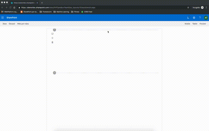
}To test that, run the web part in SharePoint-hosted workbench, copy the id from Component Library's manifest (in this sample it is cd6e18e2-a8f3-4f97-9f07-7dfcecdd47ed) and paste it into Component Id property.
Voi-la!
Conclusion
SharePoint Framework gives us incredible and powerful instruments to develop customizations.And Library Component project type is a new step forward to simplify our implementation, code reusing and sharing.
Together with SPComponentLoader it allows us to implement React templates with dynamic loading of components. Similarly, it can be used to develop different data adapters, dynamic behaviors, etc.
I'm really excited and looking forward to including Library Component in GA version of SPFx.
That's all for today!
Have fun!
Comments