
In this post I want to show you step-by-step implementation of SharePoint Framework Field Customizer - React Slider Customizer.
UPDATE: on 9/25/2017 SPFx Extensions were GA-ed. The post is updated to contain the latest version of API.
Key features of the sample:
- SPFx Field Customizer implementation
- Usage of Office UI Fabric controls (in particular - Slider Control)
- Current user's permissions check
- Inline editing
- Usage of SharePoint PnP JavaScript Core Library
Prerequisites
Before following the steps in this article, be sure to proceed next 2 steps:- Get Office Developer Tenant (you can get one for free by subscribing to Office 365 Developer Program. It's an optional step as Extensions reached General Availability but it's good to have the tenant to be able to get preview versions in future.
- Set up your development environment
Scaffolding the Project
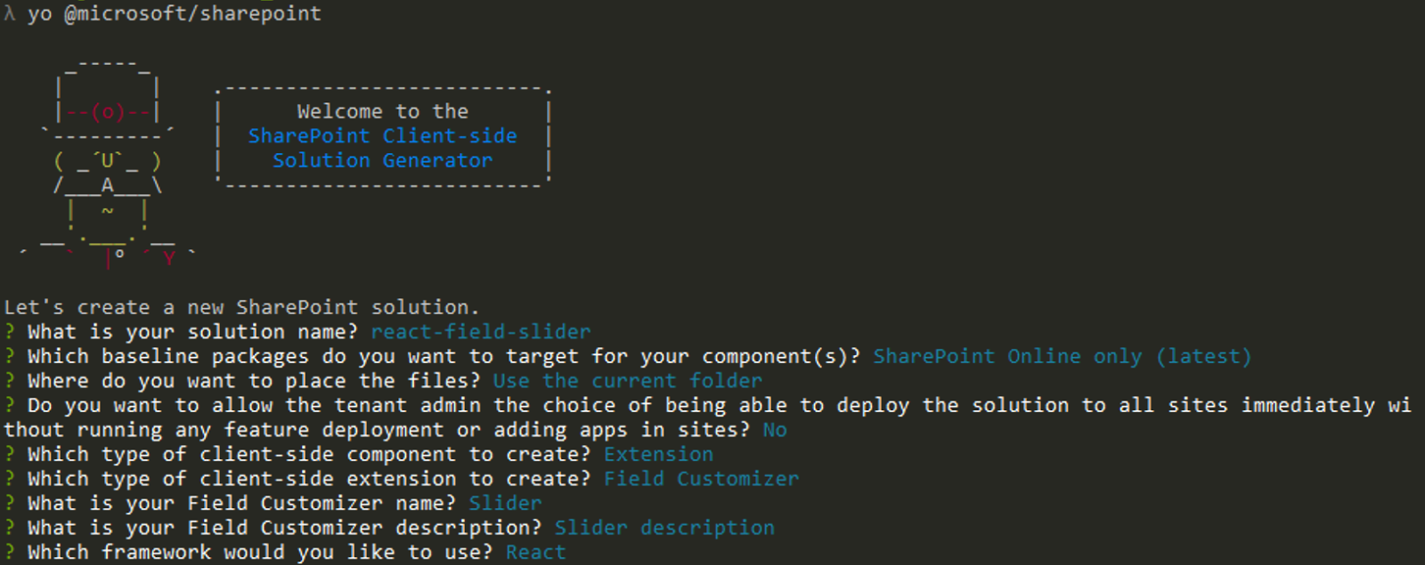
First step in any SPFx project is to "scaffold" it using Yeoman SharePoint Generator. "Scaffold" in more classic terms means generate or create from a template.Here are the steps to create a project.
- Open Command Prompt (Terminal in MacOS) or any Console tool
- Create a new directory for the project in the location you want
mkdir react-field-slider - Go to the created directory
cd react-field-slider - Start scaffolding new project with Yeoman SharePoint Generator
yo @microsoft/sharepoint - When prompted
- Accept default solution name (react-field-slider)
- For baseline packages select SharePoint Online only (latest) as SPFx Extensions are not available for SharePoint 2016
- Select Use the current folder
- You can select either y or N for availability of your extension across tenant. It depends on how you're going to install it. If you use Feature Framework to add application customizer then this option will not work as it doesn't work with Feature Framework
- Select Extension as a client-side component
- Select Field Customizer as an extension type
- Type Slider as a name
- Accept default description
- Select React as a framework
- Wait until Yeoman is installing all needed dependencies

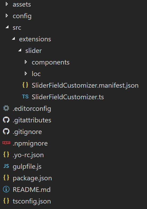
Congratulations! The project has been scaffolded!
Now you can open the project in favorite IDE.
Note: this is a TypeScript project so select the IDE that supports TypeScript language. I'm using Visual Studio Code.
The project structure should look like the one on the picture below
Debugging the Extension using gulp serve and query string
I decided to put this section at the beginning so you could run the code each time you want to check if everything works fine.SharePoint Framework extensions cannot currently be tested using the local workbench, so you'll need to test and develop them directly against a live SharePoint Online site. You do not however need to deploy your customization to the app catalog to do this, which keeps the debugging experience simple and efficient. First, compile your code and host the compiled files from the local machine by running this command:
gulp serve --nobrowserIf the code compiled without errors the server will be running on http://localhost:4321.
To test the extension
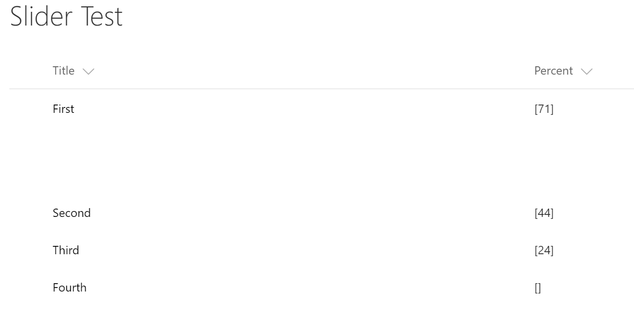
- Go to SharePoint tenant's list
- Open any list (or create one) that contains a column to be customized. In this sample Percent column will be customized
- Append next query string parameters to the list's URL:
Where:
?loadSPFX=true&debugManifestsFile=https://localhost:4321/temp/manifests.js&fieldCustomizers={"Percent":{"id":"f2f6825c-fd37-43f7-a99c-5fe6b39dd7fd"}}- loadSPFX=true ensures that the SharePoint Framework is loaded on the page. For performance reasons, the framework is not normally loaded unless at least one extension is registered. Since no components are registered yet, we must explicitly load the framework.
- debugManifestsFile=<URL> specifies that we want to load SPFx components that are being locally served. Normally the loader only looks for components in the App Catalog (for your deployed solution) and the SharePoint manifest server (for the system libraries).
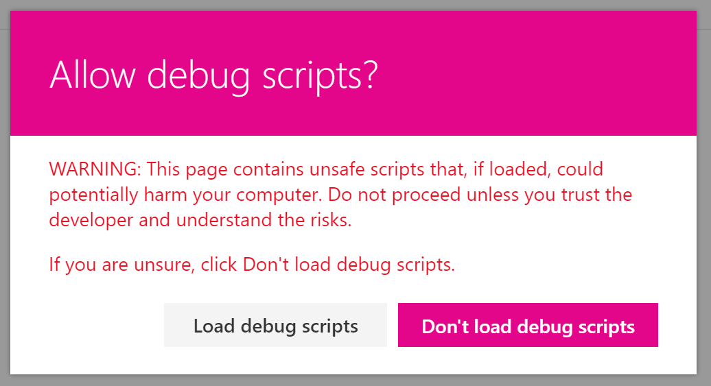
- fieldCustomizers indicates which fields in your list should have their rendering controlled by the Field Customizer. The ID parameter specifies the GUID of the extension that should be used to control the rendering of the field - ID value is located in manifest.json file of the extension. The properties parameter is an optional text string containing a JSON object that will be deserialized into this.properties for your extension (in current example properties parameter is not set).
https://terentiev.sharepoint.com/Lists/Slider%20Test/AllItems.aspx?loadSPFX=true&debugManifestsFile=https://localhost:4321/temp/manifests.js&fieldCustomizers={"Percent":{"id":"f2f6825c-fd37-43f7-a99c-5fe6b39dd7fd"}} - Accept loading of Debug Manifests
- The Percent column cells should be rendered using the Field Customizer
Adding Additional Libraries
Next step is to add external libraries (modules) that will be used in the project. For this sample the libraries are Office UI Fabric React and SharePoint PnP JS Core Library.Office UI Fabric is included automatically because React framework was selected as a basement of the extensions.
PnP JS Core can be added using npm package manager:
- In Command Prompt (Terminal) go to project directory.
- Install the PnP package
npm install sp-pnp-js --save
import pnp from 'sp-pnp-js';Implementing Slider Field Customizer Control
The logic for the customizer is located in 2 main files: SliderFieldCustomizer.ts and components/Slider.tsxSliderFieldCustomizer class is the entry point of the customization. It provides 3 main methods to implement custom logic:
- onInit method allows to run some initialization code and ensure that the execution of this code is finished before rendering.
- onRenderCell method is an entry point for actual rendering. You have access to cell's div to render your content. Also, there is a bunch of helpful objects inside this.properties property and event object (such as field value, field information, List View properties, etc.).
- onDisposeCell method allows to release all used resources.
Let's change the Slider.tsx to display a Office UI Fabric Slider control.
First, import Slider component from Office UI Fabric Slider
import { Slider as ReactSlider } from 'office-ui-fabric-react';Next step is to modify Props and State objects to meet next conditions:
- Props object should contain cell's value (nullable)
- Props object should contain handler to process Slider value change (optional)
- Props object should contain a flag to enable\disable the Slider based on user permissions
- Props object should contain list item id to pass it to value change handler
- State object should contain current value
export interface ISliderProps {
  value: string;
  id: string;
  disabled: boolean;
  onChange: (value: number, id: string) => void;
}
export interface ISliderState {
  value?: number;
}constructor(props: ISliderProps, state: ISliderState) {
super(props, state);
const intVal = parseInt(props.value);
this.state = {
value: isNaN(intVal) ? null : intVal
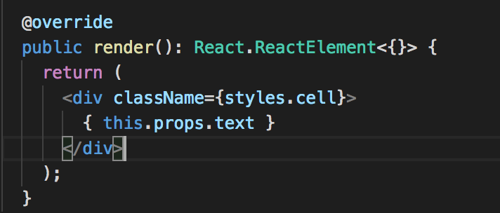
};@override
public render(): React.ReactElement<{}> {
return (
<div classname="{styles.cell}">
{this.state.value && // we're not rendering the slider if there is no value in the cell
(
<reactslider change="" current="" disabled="{this.props.disabled}" handler="" internal="" max="{100}" onchange="{this.onChange.bind(this)}" value=""> // disabled flag is based on user's permissions (see SliderFieldCustomizer class)
)}
</reactslider></div>
);
}
/**
* value change internal handler
*/
private onChange(value: number): void {
if (this.props.onChange) // we need to call external handler here
this.props.onChange(value, this.props.id);
}Add onSliderValueChanged empty method to use it as a value change handler (we'll add the code later).
private onSliderValueChanged(value: number, id: string): void {
  // awesome code goes here
};const id: string = event.row.getValueByName('ID').toString();const hasPermissions: boolean = this.context.pageContext.list.permissions.hasPermission(SPPermission.editListItems);const slider: React.ReactElement<{}> =
React.createElement(Slider, { value: value, id: id, disabled: !hasPermissions, onChange: this.onSliderValueChanged.bind(this) } as ISliderProps);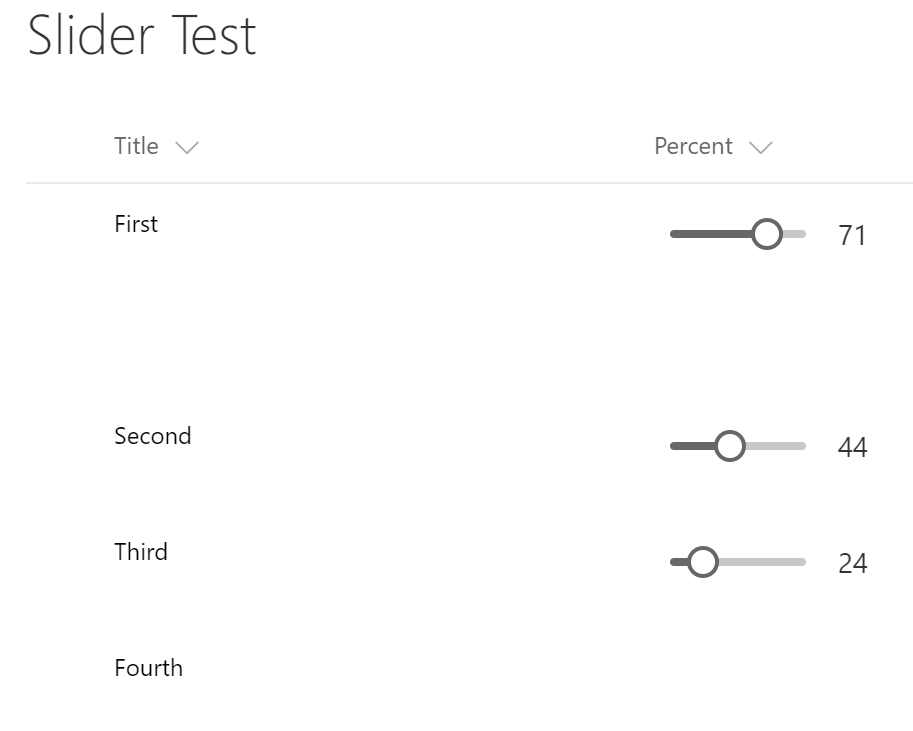
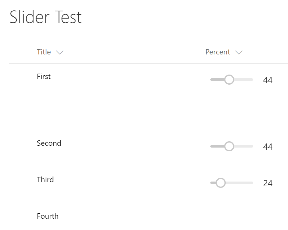
And if a user doesn't have permissions to edit items the sliders will be disabled and grayed out:
The last part of the implementation is to save values' changes to the back-end using PnP JS Core Library.
Go to onChange handler (onSliderValueChanged method) and add the code to update the value:
let updateObj: any = {}; // object-parameter for update call
updateObj[this.context.field.internalName] = value; // the value from the slider
pnp.sp.web.lists
  .getByTitle(this.context.pageContext.list.title) // getting the list
  .items.getById(parseInt(id)) // getting the item
  .update(updateObj) // updating the item
  .then((result: ItemUpdateResult): void => {
    console.log(`Item with ID: ${id} successfully updated`);
  }, (error: any): void => {
    console.log('Loading latest item failed with error: ' + error);
});Let's use window.setTimeout to implement such logic.
private onSliderValueChanged(value: number, id: string): void {
  if (this._timerId !== -1)
    clearTimeout(this._timerId);
  this._timerId = setTimeout(() => {
    let updateObj: any = {};
    updateObj[this.context.field.internalName] = value;
    pnp.sp.web.lists
      .getByTitle(this.context.pageContext.list.title) // getting the list
      .items.getById(parseInt(id)) // getting the item
      .update(updateObj) // updating the item
        .then((result: ItemUpdateResult): void => {
          console.log(`Item with ID: ${id} successfully updated`);
        }, (error: any): void => {
          console.log('Loading latest item failed with error: ' + error);
        });
  }, 1000);
}That's it! You can get the code from GitHub repo.
Have fun!
Comments