
I'm happy to announce that SharePoint Framework React Controls package starting v1.2.0 includes Field Controls - a set of React components that can be used in Field Customizer to render field's content similarly to OOB experience.
Main features of the controls:
- OOB fields experience for different types of fields (Text, Title, Urls, Lookups, etc.)
- "Factory" helper to select proper Field Control based on field's type
- Ability to provide custom CSS classes and styles to the Field Control
- It's open source
Why you may need that
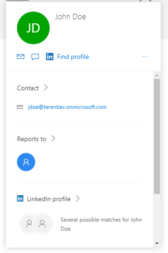
The most common scenario to use these controls is when a developer needs to slightly modify oob field rendering, for example, change background or font color or add KPI icon based on some rule.As Microsoft doesn't provide any API to call fields' default renderer (at least now) a developer needs to create all the oob markup by himself. And some of the fields are pretty complicated. For example, Person or Group provides a "hoverable" list of users selected with Persona Hover Card opened on hover:
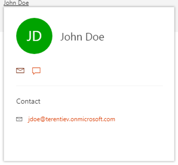
Field Controls provide similar experience and the only thing a developer needs is to provide additional CSS. Here is a Persona Hover Card from FieldUserRenderer control:
Another scenario is related to lists/document libraries that have multiple views. And potentially some fields should have custom markup in some viees but default one in others. Field Customizer is applied to the field, not to the field in the view. It means that the customization is available in any view in the list.
And here developers can use Field Controls as well and implement the condition to use custom logic or Field Controls logic based on view id.
Here are links to SharePoint UserVoice requests to provide oob fields rendering. Please, vote for them as well.
https://sharepoint.uservoice.com/forums/329220-sharepoint-dev-platform/suggestions/18810637-access-to-re-use-modern-field-render-controls
https://sharepoint.uservoice.com/forums/329220-sharepoint-dev-platform/suggestions/31530607-field-customizer-ability-to-call-ootb-render-meth
Usage
Package Installation
To get started you have to install the following dependency to your project: @pnp/spfx-controls-reactEnter the following command to install the dependency to your project:
npm install @pnp/spfx-controls-react --save --save-exactPackage Configuration
Once the package is installed, you will have to configure the resource file of the property controls to be used in your project. You can do this by opening the config/config.json and adding the following line to the localizedResources property:"ControlStrings": "./node_modules/@pnp/spfx-controls-react/lib/loc/{locale}.js"Working with Field Controls
The main scenario to use this package is to import FieldRendererHelper class from @pnp/spfx-controls-react/lib/Utilities and to call getFieldRenderer method. This method returns a Promise with a proper field renderer (Promise<JSX.Element>) based on field's type. It means that it will automatically select proper component that should be rendered in this or that field. This method also contains logic to correctly process field's value and get correct text to display (for example, Friendly Text for DateTime fields). As the method returns Promise it should be called in one of React component lifecycle methods, for example, componentWillMount that will occur before render. The resulting field renderer could be saved in the element's state and used later in render method.Here is an example on how it can be used inside custom Field Customizer component (.tsx file):
import { FieldRendererHelper } from '@pnp/spfx-controls-react/lib/Utilities';

//...

export interface IOotbFieldsState {
  fieldRenderer?: JSX.Element;
}

//...

@override
  public componentWillMount() {
    FieldRendererHelper.getFieldRenderer(this.props.value, {
      className: this.props.className,
      cssProps: this.props.cssProps
    }, this.props.listItem, this.props.context).then(fieldRenderer => {
      this.setState({
        fieldRenderer: fieldRenderer
      });
    });
  }

public render(): React.ReactElement<{}> {
    return (
      <div className={styles.cell}>
        {this.state.fieldRenderer}
      </div>
    );
  }
And that's it!
Here are the links to GitHub Repo and Package documentation.
Please, feel free to post the issues, questions and PRs to the repo.
Have fun!
Comments