SPFx. Client Web Part Property Pane Dependent Properties. Part III: Styling Dependent Properties Control as Office UI Fabric dropdowns. Knockout version.
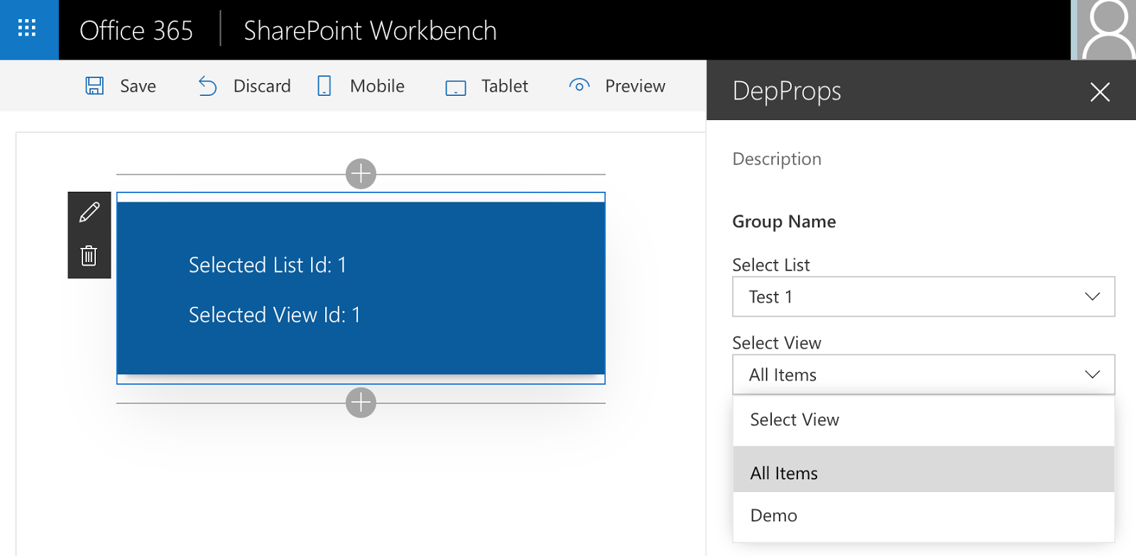
This is the last post of three that explain how to add dependent properties to Client Web Part Property Pane. As an example of such properties I decided to use Lists dropdown and Views dropdown. Views dropdown is populated based on selected List. As a result of these three posts we'll have a fully working web part with ability to select List View in Property Pane:
SPFx. Client Web Part Property Pane Dependent Properties. Part III: Styling Dependent Properties Control as Office UI Fabric dropdowns. Knockout version. (current post)
All the code is available on GitHub (https://github.com/AJIXuMuK/SPFx/tree/master/dep-props-custom-class) I'm using Visual Studio Code IDE for the tutorial. This post describes creation of custom Knockout bindings, custom Knockout components and styling your components in Office UI Fabric manner.
In previous post we created a custom field that consists of two dependent dropdowns. Everything works good but looks not so good. It would be much better if our dropdowns look similar to Office UI Fabric Dropdown. Unfortunately there is no Knockout version of Office UI Fabric Dropdown and a Dropdown from Fabric JS is pretty static - it creates <ul> markup based on a <select>. But if you change something in your select dynamically it won't reflect UL until you recreate the Fabric JS dropdown. So let's create our own Knockout.js component styled as Office UI Fabric Dropdown. You can find documentation on Knockout components here so I won't spend time to describe it deeply. In few words we need to create a view, a viewmodel and register the component to be able to use it in our app. First of all, we need to create some interface that will describe a single dropdown item. We need value, text and selected flag to describe an item (/webparts/depProps/components/dropdown/viewmodel):
Based on the above we can create an interface that describes parameters of our component (/webparts/depProps/components/dropdown/viewmodel):
/**
* Parameters that can be provided to Dropdown component
*/exportinterfaceIDropdownViewModelParams{/**
* options collection as KnockoutObservableArray
*/options:KnockoutObservableArray<idropdownoption>;/**
* Dropdown empty element text and text of Dropdown label
*/optionsCaption:string;/**
* Selected value
*/value:KnockoutObservable<string>;/**
* Is Dropdown disabled
*/disabled?:KnockoutObservable<boolean>;}</boolean></string></idropdownoption>
Now let's look at Office UI Fabric Dropdown markup to understand what we need to implement in our component's view:
<div><labelclass="ms-Label">Label goes here</label><divclass="ms-Dropdown"><spanclass="ms-Dropdown-title">Selected Option</span><iclass="ms-Dropdown-caretDown ms-Icon ms-Icon--ChevronDown"></i><ulclass="ms-Dropdown-items"><liclass="ms-Dropdown-item"role="option">Option 1</li><liclass="ms-Dropdown-item">Option 2</li><!-- etc. --></ul></div></div>
This is how our view should look. LI elements will be created dynamically based on options property. The only thing we need to decide is how to implement inserting of optionsCaption dummy item before options in the dropdown. There are two ways for that. First one is to implement the logic in viewmodel: get options array and insert a new element there which will have optionsText as text, -1 as value. And in the view we can use simple for binding to iterate through the items and create li elements for each of them. Second one is to create a custom binding similar to out-of-the-box options binding. I selected the second option to practice in custom bindings. Let's call the binding class as MsDropdownOptions and put it in /webparts/depProps/bindings/MsDropdownOptions.ts:
import*askofrom'knockout';/**
* Knockout 'msoptions' binding.
* Allows to bind Fabric UI dropdown options in the similar way to standard select options binding
*/classMsDropdownOptions{constructor(){this.init=this.init.bind(this);this.update=this.update.bind(this);}/**
* This will be called when the binding is first applied to an element
*/publicinit(element:any,valueAccessor:()=>any,allBindingsAccessor?:KnockoutAllBindingsAccessor,viewModel?:any,bindingContext?:KnockoutBindingContext):void|{controlsDescendantBindings:boolean;}{// check if binding is applied to the correct elementif(element.tagName.toLowerCase()!=='div'||element.className.indexOf('ms-Dropdown')===-1)thrownewError('msoptions binding applies only to <div class="ms-Dropdown"> elements');// removing previous content if anythis.removePreviousContent(element);return{'controlsDescendantBindings':true};}/**
* Removes previous content of dropdown
*/privateremovePreviousContent(element:any){consttitleEl:HTMLSpanElement=element.querySelector('span');if(titleEl){titleEl.textContent='';}constlistEl=element.querySelector('ul');if(!listEl)thrownewError('Incorrect markup in ms-Dropdown element');while(listEl.children.length){listEl.children[0].remove();}}/**
* This method adds all the options and also updates selected item and text
*/privateaddNewContent(element:any,options:{}[],selectedValue:KnockoutObservable<string>,itemSelected:(evt:MouseEvent)=>any):void{consttitleEl:HTMLSpanElement=element.querySelector('span');constlistEl=element.querySelector('ul');letselectedValueUnwrapped:string=selectedValue&&ko.utils.unwrapObservable(selectedValue);letselectedValueChanged:boolean=false;if(!listEl||!titleEl)thrownewError('Incorrect markup in ms-Dropdown element');for(leti:number=0,len:number=options.length;i<len;i++){constliEl:HTMLLIElement=document.createElement('li');constoption=options[i];liEl.textContent=option['text'];liEl.setAttribute('aria-value',option['value']);liEl.setAttribute('role','option');liEl.setAttribute('aria-text',option['text']);liEl.className='ms-Dropdown-item';letisSelected:boolean=false;if(selectedValueUnwrapped&&selectedValueUnwrapped===option['value'])isSelected=true;else{isSelected=option['selected']===true||option['selected']===true||option['selected']==='selected';if(isSelected){selectedValueUnwrapped=option['value'];selectedValueChanged=true;}}liEl.setAttribute('aria-selected',isSelected+'');if(isSelected){titleEl.textContent=option['text'];liEl.className+=' is-selected';}if(itemSelected){liEl.addEventListener('click',itemSelected);// itemSelected is provided from binding as well}listEl.appendChild(liEl);}if(!titleEl.textContent&&options.length>0){titleEl.textContent=options[0]['text'];listEl.children[0].setAttribute('aria-selected','true');selectedValueUnwrapped=options[0]['value'];selectedValueChanged=true;}if(selectedValueChanged&&selectedValue)selectedValue(selectedValueUnwrapped);}/**
* This will be called once when the binding is first applied to an element,
* and again whenever any observables/computeds that are accessed change
*/publicupdate(element:any,valueAccessor:()=>any,allBindingsAccessor?:KnockoutAllBindingsAccessor,viewModel?:any,bindingContext?:KnockoutBindingContext):void{this.removePreviousContent(element);letunwrappedArray:any=ko.utils.unwrapObservable(valueAccessor());letcaptionValue:any;letfilteredArray:{}[]=[];letitemSelected:(evt:MouseEvent)=>any;if(unwrappedArray){if(typeofunwrappedArray.length=="undefined")// Coerce single value into arrayunwrappedArray=[unwrappedArray];// Filter out any entries marked as destroyedfilteredArray=ko.utils.arrayFilter(unwrappedArray,(item)=>{returnitem===undefined||item===null||!ko.utils.unwrapObservable(item['_destroy']);});// If caption is included, add it to the arrayif(allBindingsAccessor['has']('optionsCaption')){captionValue=ko.utils.unwrapObservable(allBindingsAccessor.get('optionsCaption'));// If caption value is null or undefined, don't show a captionif(captionValue!==null&&captionValue!==undefined){filteredArray.unshift({value:"-1",text:captionValue});}}}else{// If a falsy value is provided (e.g. null), we'll simply empty the select element}if(allBindingsAccessor['has']('itemSelected'))itemSelected=allBindingsAccessor.get('itemSelected')as(evt:MouseEvent)=>any;this.addNewContent(element,filteredArray,allBindingsAccessor.get('value'),itemSelected);}}
Also we need to register this binding inside knockout. For that we need to extend KnockoutBindingHandlers interface definition with a new property (/webparts/depProps/bindings/bindings.d.ts):
And also we'll create a function that will register our custom binding (/webparts/depProps/bindings/MsDropdownOptions.ts):
/**
* This API adds custom 'msoptions' binding to Knockout bindingHandlers object
*/exportfunctionaddMsDropdownBindingHandler():void{if(!ko.bindingHandlers.msoptions)ko.bindingHandlers.msoptions=newMsDropdownOptions();}
Now we can use this binging in our view. So the final markup with bindings (based on Office UI Fabric Dropdown markup) will look like (/webparts/depProps/components/dropdown/view.ts):
msoptions, optionsCaption and itemSelected parameters are handled inside created custom binding.
As you can see there are some methods in the binding (onOpenDropdown, onItemSelected, isOpen, disabled). All these methods should be implemented in a viewmodel. So let's create the viewmodel (/webpars/depProps/components/dropdown/viewmodel.ts).
import*askofrom'knockout';/**
* ViewModel of custom Dropdown component
*/exportclassDropdownViewModel{/**
* Last opened Dropdown ViewModel
*/privatestatic_openedDropdownVM:DropdownViewModel;/**
* Component initial parameters
*/private_params:IDropdownViewModelParams;/**
* Dropdown options
*/protectedoptions:KnockoutObservableArray<IDropdownOption>;/**
* Options caption
*/protectedoptionsCaption:string;/**
* Current selected value
*/protectedvalue:KnockoutObservable<string>;/**
* Is Dropdown opened
*/protectedisOpen:KnockoutObservable<boolean>;/**
* Is Dropdown disabled
*/protecteddisabled:KnockoutObservable<boolean>;/**
* ctor
*/constructor(params:IDropdownViewModelParams){this._params=params;this.options=params.options;this.optionsCaption=params.optionsCaption;this.value=params.value;if(params.disabled)this.disabled=params.disabled;elsethis.disabled=ko.observable<boolean>(false);// initally dropdown is closedthis.isOpen=ko.observable<boolean>(false);//// binding all handlers to current instance//this.onItemSelected=this.onItemSelected.bind(this);this.onOpenDropdown=this.onOpenDropdown.bind(this);this._onDocClick=this._onDocClick.bind(this);}/**
* item selected handler
*/publiconItemSelected(evt:MouseEvent){varselectedItem=evt.srcElement;this.value(selectedItem.getAttribute('aria-value'));}/**
* Open-close dropdown handler
*/publiconOpenDropdown(vm:DropdownViewModel,evt:MouseEvent){if(this.disabled())return;constisOpen:boolean=ko.utils.unwrapObservable(this.isOpen);evt.stopPropagation();this.isOpen(!isOpen);if(!isOpen){if(DropdownViewModel._openedDropdownVM&&DropdownViewModel._openedDropdownVM!==this){DropdownViewModel._openedDropdownVM._onDocClick(null);}DropdownViewModel._openedDropdownVM=this;document.addEventListener('click',this._onDocClick);}}/**
* document.onclick handler
*/private_onDocClick(evt:MouseEvent){this.isOpen(false);document.removeEventListener('click',this._onDocClick);}}
Now register it (/webparts/depProps/components/dropdown/Dropdown.ts):
importDropdownViewfrom'./view';import{DropdownViewModel}from'./viewmodel';import*askofrom'knockout';import{addMsDropdownBindingHandler}from'../../bindings/MsDropdownOptions';/**
* custom dropdown component name
*/exportconstDROPDOWN_COMPONENT:string='spfx_dropdown';/**
* API to register custom dropdown component
*/exportfunctionregisterDropdown():boolean{if(!ko.bindingHandlers.msoptions)addMsDropdownBindingHandler();if(!ko.components.isRegistered(DROPDOWN_COMPONENT)){ko.components.register(DROPDOWN_COMPONENT,{template:DropdownView.templateHtml,viewModel:DropdownViewModel});}returntrue;}
And finally use it in our custom Property Pane field. For that:
import component name in PropertyPaneViewSelectorView.ts
and change PropertyPaneViewSelector class to register the component in constructor:
// somewhere at the beginning of the fileimport{registerDropdown}from'../components/dropdown/Dropdown';/**
* ctor
*/publicconstructor(_targetProperty:string,_properties:IPropertyPaneViewSelectorFieldPropsInternal){// add this to the end of the constructor method// registering used custom Knockout components (dropdown)this._registerComponents();}/**
* Registers used custom Knockout components
*/private_registerComponents():void{registerDropdown();}
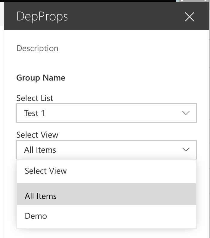
Now we finished and can enjoy our beautiful custom Property Pane Field with Office UI Fabric-like dropdowns:
Let me know if you have any questions or comments.


 Let me know if you have any questions or comments.
Comments