This is the second post of three that explain how to add dependent properties to Client Web Part Property Pane. As an example of such properties I decided to use Lists dropdown and Views dropdown. Views dropdown is populated based on selected List. Here is a content of 3 posts: As a result of these three posts we'll have a fully working web part with ability to select List View in Property Pane:
This post describes how to create custom Property Pane Field with 2 simple unstyled dropdowns (<select> elements).
The main idea of creating this web part is to be able to populate Views dropdown dynamically when user selects value in Lists dropdown.
First idea was to use 2 PropertyPaneDropdown controls. If user selects something from one dropdown we're doing something to get data and push this data to the second dropdown.
It won't work for at least 3 reasons:
Data request is an asynchronous operation. But I didn't find any method to override that will wait for this data before rerender the property pane.
Property Pane rerender and propertyPaneSettings property getter are called dynamically only if web part property pane behavior is set to Reactive. It means that you won't be able to do anything in non-Reactive property pane (when there is an Apply button at the bottom of the pane).
You can't initiate Property Pane refresh from your custom field or from web part.
That's why the only way to implement dependent properties is to create custom Property Pane Field that will contain both dropdowns in it.
Let's consider that our custom Property Pane Field is named PropertyPaneViewSelector. It will have 2 properties that should be available in web part (and saved with web part): List Id and View Id.
To make these properties available in web part we need to update Web Part Properties interface. In our case it is named as IDepPropsWebPartProps. We can either add 2 separate properties there or create a complex object with 2 properties in it. I think that the second option is logically better because List Id and View Id will be populated from a single Property Pane Field.
So let's create an interface for the complex property object first (I put it in /webparts/depProps/controls/Common.ts) and then change the IDepPropsWebPartProps
IPropertyPaneViewSelectorProps
/**
* Complex object to define property in a web part
*/exportinterfaceIPropertyPaneViewSelectorProps{/**
* Selected list id
*/listId:string;/**
* Selected view id
*/viewId:string;}
Now we can access these props in web part class like this.properties.depProps.listId and this.properties.depProps.viewId. Let's set defaults for these properties. For that we need to go to DepPropsWebPart.manifest.jsonand in preconfiguredEntries object change properties property like that:
"preconfiguredEntries":[{//// ... some other properties //"properties":{"depProps":{"listId":"-1","viewId":"-1"}}}]
Let's change web part render method to display currently selected List Id and View Id:
Now let's start with custom Property Pane Field. To create such field we need to create a class that implements IPropertyPaneField interface:.
/**
* PropertyPane field.
*/exportinterfaceIPropertyPaneField<TProperties>{/**
* Type of the PropertyPane field.
*/type:IPropertyPaneFieldType;/**
* Target property from the web part's property bag.
*/targetProperty:string;/**
* Strongly typed properties object. Specific to each field type.
* Example: Checkbox has ICheckboxProps, TextField has ITextField props.
*
* @internalremarks - These props are from the office-ui-fabric-react.
* These props may not be extensive as the fabric-react ones. This is intentional.
* - We are not including any callbacks as part of the props, as this might end up breaking
* the internal flow and cause unwanted problems.
* - Currently discussions are going on whether to include styling elements or not. Based on
* the output of the discussions, changes to the styling related props will take place.
*
* We are including only those which are supported by the web part framework.
*/properties:TProperties;}
As you can see it's a so called Generic interface and when implemented TProperties should be changed to some specific interface. And one more thing about this interface - it should extend IPropertyPaneCustomFieldProps if we want to be able to customize rendering. And this interface will be used to pass parameters to the constructor of our field. It means it should contain all the properties we need to get from web part to initialize the field correctly. So we need to think what properties we need in our field.
onRender and onDispose? from base interface
listId and viewId - our main data
also we need some labels to display near dropdowns. Of course we can hardcode them or get from some source inside the field. But we can set them from web part. It will make our field more isolated and flexible. Let's name these properties as listLabel and viewLabel
we will use data helpers created in previous post. And these helpers use web part context. So we need this context in our properties as well.
we need to notify web part that something has changed in our field. For this purpose we'll add onPropertyChange property in the interface to get the handler from a web part.
Final interface will look like that (/webparts/depProps/controls/Common.ts):
/**
* PropertyPaneViewSelector component internal props
*/exportinterfaceIPropertyPaneViewSelectorFieldPropsInternalextendsIPropertyPaneCustomFieldProps{/**
* Path to target property in web part properties
*/targetProperty:string;/**
* web part context
*/context:IWebPartContext;/**
* selected list id
*/listId:string;/**
* selected view id
*/viewId:string;/**
* onPropertyChange event handler
*/onPropertyChange(propertyPath:string,newValue:any):void;/**
* Label to show in list dropdown
*/listLabel:string;/**
* Label to show in view dropdown
*/viewLabel:string;}
You can ask why it is named with Internal prefix. I'll describe it in a second. For now our custom class will look like that (/webparts/depProps/controls/PropertyPaneViewSelector.ts):
/**
* PropertyPaneViewSelector component
*/classPropertyPaneViewSelectorimplementsIPropertyPaneField<IPropertyPaneViewSelectorFieldPropsInternal>{/**
* This is a Custom field
*/publictype:IPropertyPaneFieldType=IPropertyPaneFieldType.Custom;/**
* Path to target property in web part properties
*/publictargetProperty:string;/**
* component properties
*/publicproperties:IPropertyPaneViewSelectorFieldPropsInternal;/**
* selected list id
*/publiclistId:string;/**
* selected view id
*/publicviewId:string;/**
* ctor
*/publicconstructor(_targetProperty:string,_properties:IPropertyPaneViewSelectorFieldPropsInternal){this.targetProperty=_targetProperty;this.properties=_properties;this.properties.onRender=this._render.bind(this);// applying custom rendering methodthis.properties.onDispose=this._dispose.bind(this);// applying custom disposing methodthis.listId=_properties.listId;this.viewId=_properties.viewId;}/**
* Rendering the component
*/private_render(elem:HTMLElement):void{// custom rendering}private_dispose(elem:HTMLElement):void{// custom dispose}}
If you look at out-of-the-box Property Pane Fields, you'll see that field classes are not created directly. There is always a helper function that creates an instance of Field's class. Let's create helper function for our class. Also this function will allow us to hide onRender and onDispose as we want to implement them internally. That's why we created Internal properties interface. Let's create 'external' one (/webparts/depProps/controls/Common.ts):
/**
* PropertyPaneViewSelector component public props
*/exportinterfaceIPropertyPaneViewSelectorFieldProps{/**
* web part context
*/context:IWebPartContext;/**
* selected list id
*/listId:string;/**
* selected view id
*/viewId:string;/**
* onPropertyChange event handler
*/onPropertyChange(propertyPath:string,newValue:any):void;/**
* Label to show in list dropdown
*/listLabel:string;/**
* Label to show in view dropdown
*/viewLabel:string;}
and a helper function (/webparts/depProps/controls/PropertyPaneViewSelector.ts):
/**
* Helper method to create a ViewSelectorField on the PropertyPane.
* @param targetProperty - Target property the viewselector is associated to.
* @param properties - Strongly typed viewselector properties.
*/exportfunctionPropertyPaneViewSelectorField(targetProperty:string,properties:IPropertyPaneViewSelectorFieldProps):IPropertyPaneField<IPropertyPaneViewSelectorFieldProps>{varinternalProps:IPropertyPaneViewSelectorFieldPropsInternal={context:properties.context,listId:properties.listId,viewId:properties.viewId,listLabel:properties.listLabel,viewLabel:properties.viewLabel,onPropertyChange:properties.onPropertyChange,targetProperty:targetProperty,onRender:null,onDispose:null};returnnewPropertyPaneViewSelector(targetProperty,internalProps);}
Now we can call the helper function from web part propertyPaneSettings getter:
Now we need to implement UI for the Field and logic to get data from our data helpers. In this post I'll show example of simple select elements without Office UI Fabric-like styling. I prefer to use Knockout.js as a framework (because I know it better than React and because looks like it is used for Lists and Libraries new experience). To use Knockout we need to install npm module:
npm i knockout --save-dev
And add path to knockout js file in config/config.json in externals section:
So we'll create Model, View and ViewModel for our field. Let's start with model. It should retrieve lists and views from data helpers and... that's it(/webparts/depProps/controls/PropertyPaneViewSelectorModel.ts):
The view will contain 2 select elements with bindings (in the GitHub repository the view code is updated to render Office UI Fabric-like markup that will be described in the next post):
And finally ViewModel that contains binded properties and logic to update UI and initiate web part update (in the Git repository the ViewModel code is updated to work with Office UI Fabric-like dropdowns that will be described in the next post):
import{IWebPartContext}from'@microsoft/sp-client-preview';import{ISPList,ISPView}from'../common/SPEntities';import{PropertyPaneViewSelectorModel}from'./PropertyPaneViewSelectorModel';import*askofrom'knockout';import{IPropertyPaneViewSelectorFieldPropsInternal}from'./Common';import{IDropdownOption}from'../components/dropdown/viewmodel';/**
* ViewSelector component view model
*/exportclassPropertyPaneViewSelectorViewModel{/**
* Web part context
*/private_context:IWebPartContext;/**
* Current List Id
*/private_listId:string;/**
* Current View Id
*/private_viewId:string;/**
* ViewSelector component properties
*/private_properties:IPropertyPaneViewSelectorFieldPropsInternal;/**
* MVVM model
*/private_model:PropertyPaneViewSelectorModel;/**
* Observable collection of lists
*/protectedlists:KnockoutObservableArray<ISPList>;/**
* Observable collection of views
*/protectedviews:KnockoutObservableArray<ISPView>;/**
* Current selected list
*/protectedcurrentList:KnockoutObservable<string>;/**
* Current selected view
*/protectedcurrentView:KnockoutObservable<string>;/**
* Flag if there is a list selection
*/protectedisListSelected:KnockoutObservable<boolean>;/**
* List dropdown label
*/protectedlistLabel:string;/**
* View dropdown label
*/protectedviewLabel:string;/**
* ctor
* */publicconstructor(_properties:IPropertyPaneViewSelectorFieldPropsInternal){this._properties=_properties;this._context=_properties.context;this._listId=_properties.listId;this._viewId=_properties.viewId;this.listLabel=_properties.listLabel;this.viewLabel=_properties.viewLabel;this.currentList=ko.observable<string>(this._listId);this.currentView=ko.observable<string>(this._viewId);this.isListSelected=ko.observable<boolean>(this._listId!=='-1');// subscribing on changes in lists dropdownthis.currentList.subscribe((value)=>{this._listId=value;this._initViews().then(()=>{this.isListSelected(this._listId!=='-1');});this._firePropertyChange();});// subscribing on changes in view dropdownthis.currentView.subscribe((value)=>{this._viewId=value;this._firePropertyChange();});this.lists=ko.observableArray<ISPList>();this.views=ko.observableArray<ISPView>();this._model=newPropertyPaneViewSelectorModel(this._context);}/**
* Fires property changed event handler
* This method should be called in 'Reactive' mode of web part properties pane
*/private_firePropertyChange():void{if(this._properties.onPropertyChange){this._properties.onPropertyChange(this._properties.targetProperty,{listId:this._listId||'-1',viewId:this._viewId||'-1'});}}/**
* Initializes the view model
*/publicinit():Promise>void<{returnnewPromise>void<((resolve)=>{this._model.getLists().then((lists)=>{// getting liststhis.lists(lists);this._initViews().then(()=>{resolve();});});});}/**
* Initializes views collection based on selected list
*/private_initViews():Promise<void>{returnnewPromise<void>((resolve)=>{if(this._listId){this._model.getViews(this._listId).then((views)=>{// getting viewsthis.views(views);resolve();});}elseresolve();});}}
Final step is to call View's rendering in Field render method, initialize ViewModel and apply Knockout bindings:
/**
* Rendering the component
*/private_render(elem:HTMLElement):void{this._view.render(elem).then(()=>{// rendering of HTML markupthis._viewModel.init().then(()=>{// then getting datako.applyBindings(this._viewModel,elem);// then applying bindings});});}
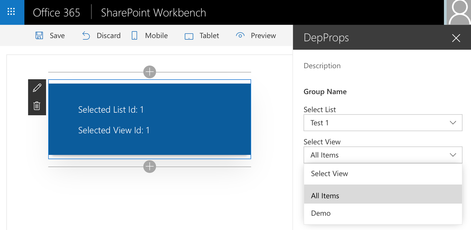
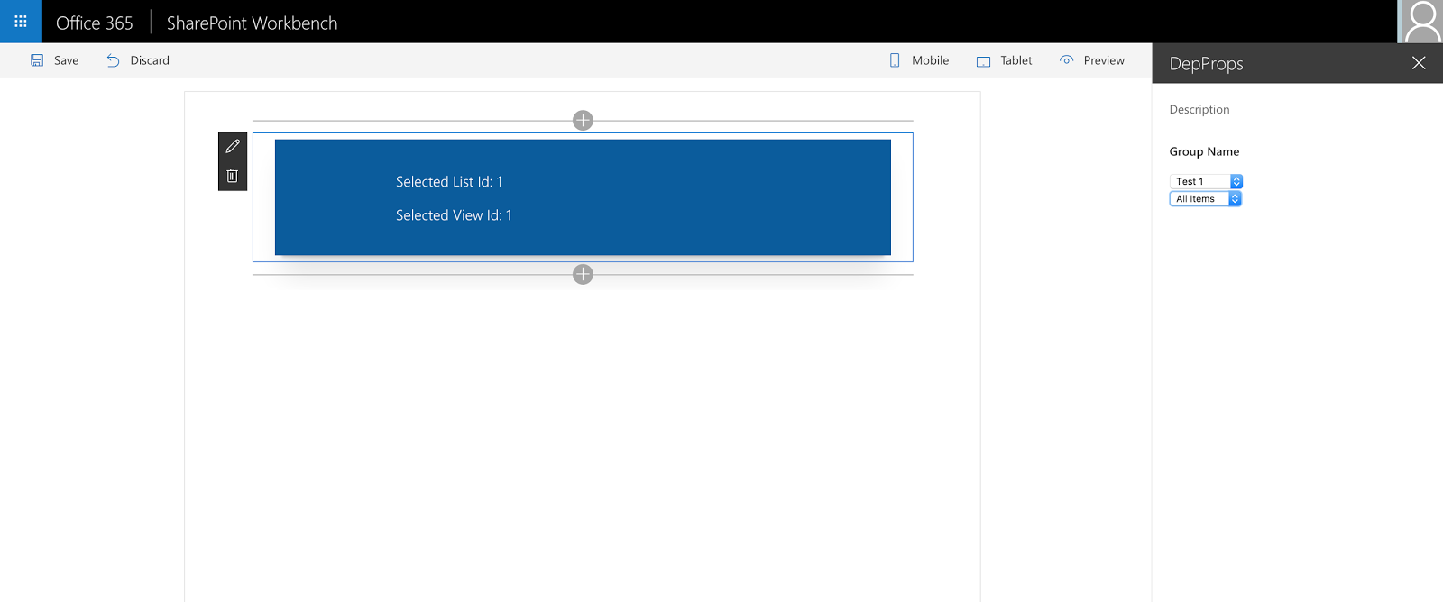
Now you can see the result:
There is a lot of code here in the post. But there is nothing really difficult to understand. Let me know if you have any questions or comments. See you in next post. Have fun!


 There is a lot of code here in the post. But there is nothing really difficult to understand. Let me know if you have any questions or comments.
Comments