
If you are a SharePoint Framework developer, you're most likely aware that SPFx allows you to refer to the theme
colors of the context site. As a result, if your web part is placed on a site that uses a red theme, it uses the red
palette as well, and if it's placed on a site that uses the blue theme, it automatically adjusts itself to use the blue
palette. All of this is done automatically without any changes to the web part code in between.
But what if you
expose your web part to Microsoft Teams? And selected theme in Teams is Dark or Contrast?
Unfortunately, SharePoint
Framework doesn't handle MS Teams themes for you, you should do that by yourself.
And it's not a big deal if you
have few controls in the web part.
But what if your project contains tens of different components?
In this
post I want to share the approach I used to support MS Teams themes in the web part that has about 50 different
components. Note: I use React for production SPFx development, so all the thoughts below may not be applicable to
other frameworks, especially if the components are not so encapsulated as in React.
Initial State
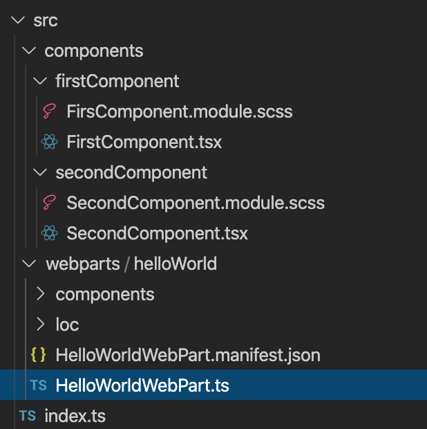
Let's say, you were developing your web part for SharePoint. And as a good developer, you have a separate folder with a separate CSS (SCSS) for each component. And, of course, you use SPFx theme colors.As a result, you have a project structure like:
And inside your SCSS you can have something like:
    .firstComponent {
        background: "[theme:white, default:#fff]";
        color: "[theme:primaryText, default:#333]";

        .button {
            background: "[theme:themePrimary, default:#0078d4]";
            color: "[theme:white, default:#fff]";
        }
    }
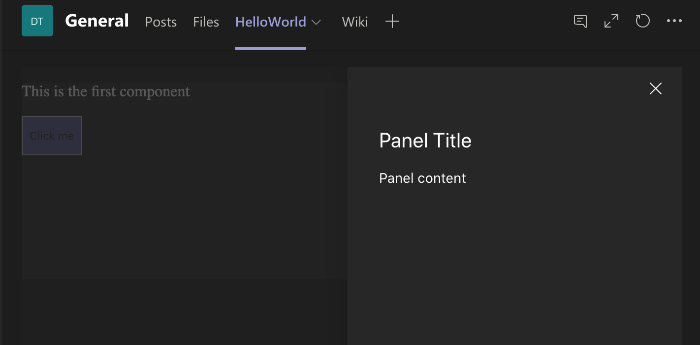
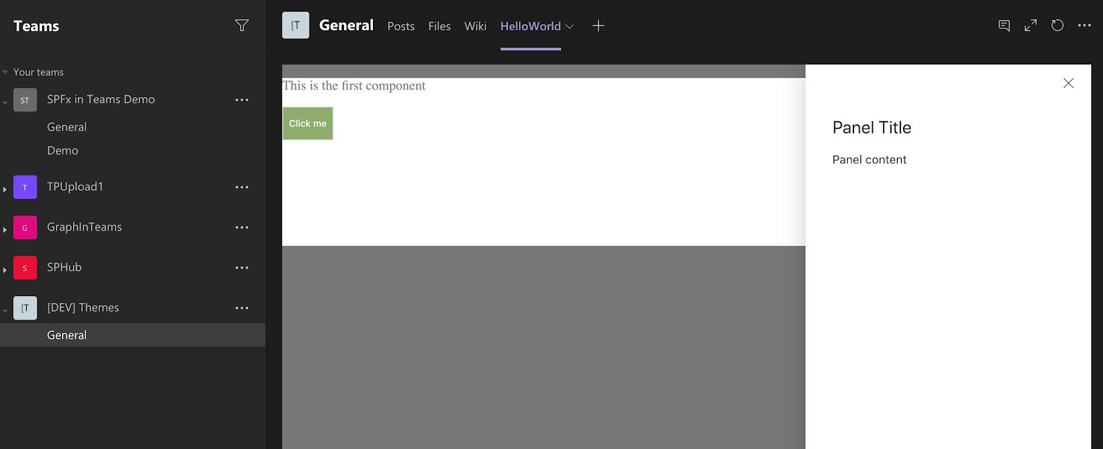
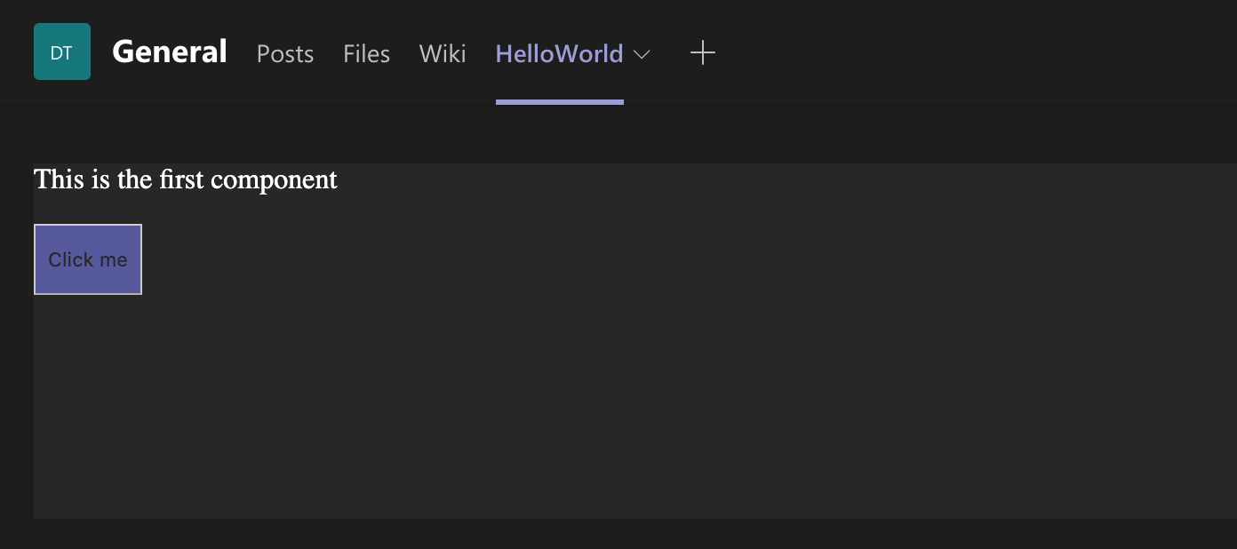
But in MS Teams, especially with dark theme, it may look not so good:
It happens because your web part is still "lives" in the context of the underlying site. And, in my case, it has "green" theme.
And if you use Office UI Fabric components, all of them will either use their own default styles or the theme from SharePoint site as well:
So, to handle Teams themes correctly we'll need:
- Handle our own components' styles
- Correctly override Office UI Fabric styles
1. Handle Theme change in MS Teams
The first step is to handle theme change in Teams.And Teams JavaScript SDK contains a handler registerOnThemeChangeHandler that we can use to be informed when the theme is changed.
Team's context also contains theme property that shows the current theme: default, dark, or contrast.
Knowing that, we can use the next code to handle the theming:
protected async onInit(): Promise<void> {
    if (this.context.sdks.microsoftTeams) {
        // checking that we're in Teams
        const context = this.context.sdks.microsoftTeams!.context;
        this._applyTheme(context.theme || 'default');
        this.context.sdks.microsoftTeams.teamsJs.registerOnThemeChangeHandler(this._applyTheme);
    }
}
private _applyTheme = (theme: string): void => {
    this.context.domElement.setAttribute('data-theme', theme);
document.body.setAttribute('data-theme', theme);Why data attribute on body?
You may ask why are we setting data attribute? And why on body, not the web part's root DOM element?There are multiple reasons for that:
- All "layer" components of Office UI Fabric (Dialogs, Panels, etc.) are rendered outside of the web part's DOM. If our attribute is set on the web part's root DOM element we won't be able to process these "layer" components.
- We can't use scoped CSS class names (className_<hash>). The reason for that is the styles are scope for
each component separately.
And if we assign, for example, styles.dark class in the web part's root component it will be trasformed to something like dark_6e6e1386.
But in our FirstComponent it will be dark_32a77d9d.
As a result we won't be able to use nested CSS rules like:.dark { .firstComponent { } } - You can use global class name instead of data attribute. I just prefer data attribute.
2. Design Your Components for Teams Themes
Next step is to select what colors to use for each of 3 Teams themes.In ideal world designer should help you with that...
But in real world we can use some helper tools to achieve it by ourselves.
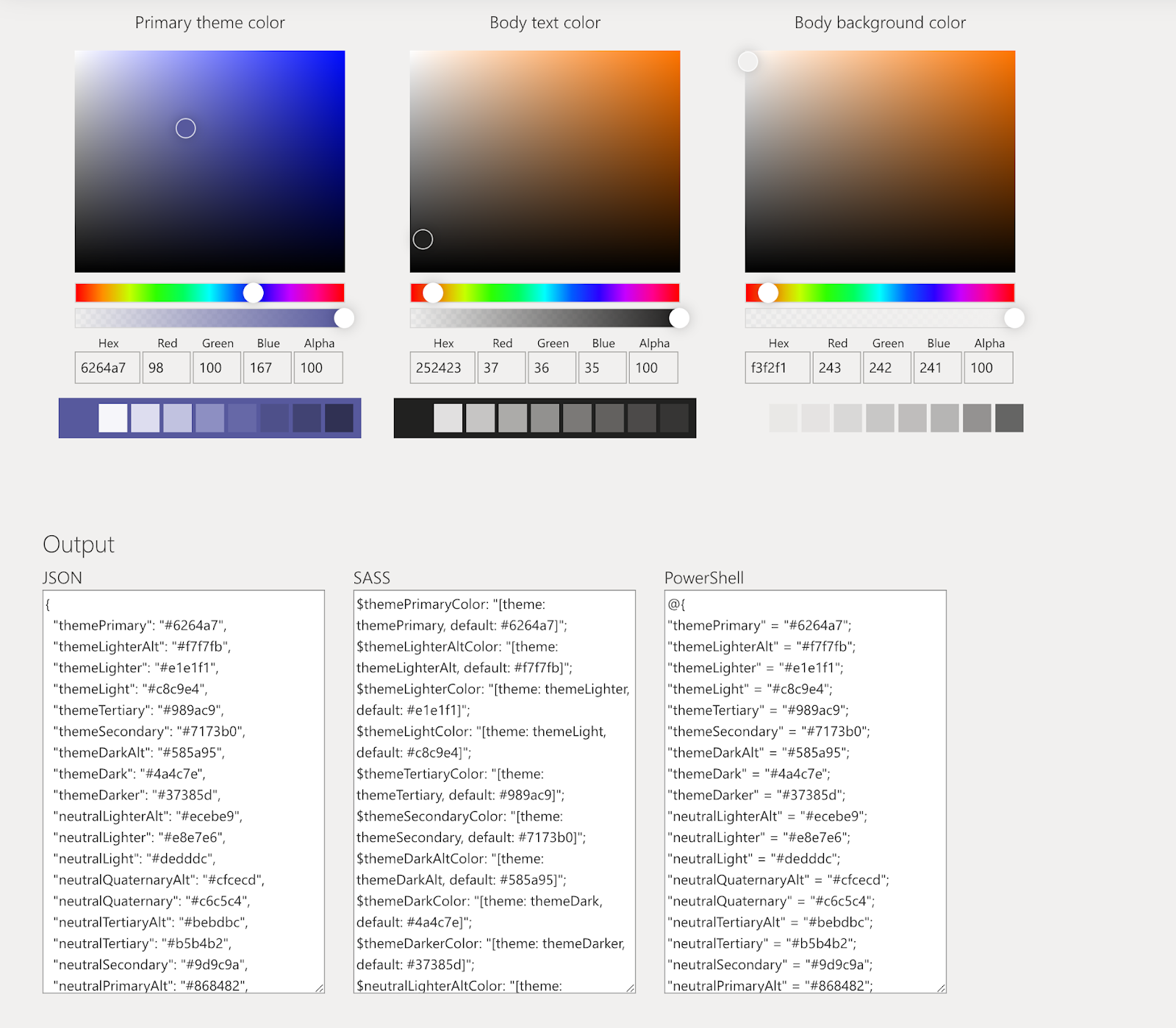
For example, we can use SharePoint Theme Generator. Good thing in using it - it will generate a set of the same variables that we used for SharePoint. For example, you'll have white, primaryText and themePrimary colors. And as a result, you could use these generated colors in the same place where the default variable was used.
So, for default Teams theme let's set the next values in the Generator:
- Primary theme color: #6264a7
- Body text color: #252423
- Body background color: #F3F2F1
Store generated variables for future use.
And let's do the same for dark and contrast.
Dark:
- Primary theme color: #6264a7
- Body text color: #ffffff
- Body background color: #2d2c2c
Contrast:
- Primary theme color: #6264a7
- Body text color: #ffffff
- Body background color: #0000000
Of course, SharePoint Theme Generator can't give us the ideal result. Especially for contrast theme. And it's still recommended to either tweak the colors a bit if needed or beg a designer to help you :)
3. Define Variables for Each Color and Each Theme
Next step is to create SASS variables.For example, instead of direct
.firstComponent {
    background: "[theme:white, default:#fff]";
}
We can use variable:
$background: "[theme:white, default:#fff]";
.firstComponent {
    background: $background;
}I would also recommend to provide pretty specific names for the variables. For example, if you want to use some color as FirstComponent background, name the variable $firstComponent-background.
Let's create variables for all our custom color:
//SharePoint
$firstComponent-background: "[theme:white, default:#fff]";
$firstComponent-color: "[theme:primaryText, default:#333]";
$firstComponentButton-background: "[theme:themePrimary, default:#0078d4]";
$firstComponentButton-color: "[theme:white, default:#fff]";

// default theme
$default-firstComponent-background: #f3f2f1;
$default-firstComponent-color: #252423;
$default-firstComponentButton-background: #6264a7;
$default-firstComponentButton-color: #f3f2f1;

// dark theme
$dark-firstComponent-background: #2d2c2c;
$dark-firstComponent-color: #ffffff;
$dark-firstComponentButton-background: #6264a7;
$dark-firstComponentButton-color: #2d2c2c;

// contrast theme
$contrast-firstComponent-background: #000000;
$contrast-firstComponent-color: #ffffff;
$contrast-firstComponentButton-background: #6264a7;
$contrast-firstComponentButton-color: #000000;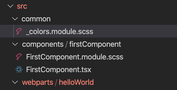
Now we can reference this file in any of our components.
4. Override Styles for Your Custom Components
Now, when we have global data attribute set and variables for all the themes we can override styles for our custom components for each theme. And they will be automatically applied as this or that value of data attribute is set.Again, using example of the FirstComponent we'll have:
@import "../../common/colors.module";
.firstComponent {
background: "[theme:white, default:#fff]";
color: "[theme:primaryText, default:#333]";
.button {
background: "[theme:themePrimary, default:#0078d4]";
color: "[theme:white, default:#fff]";
}
}
[data-theme='default'] {
.firstComponent {
background: $default-firstComponent-background;
color: $default-firstComponent-color;
.button {
background: $default-firstComponentButton-background;
color: $default-firstComponentButton-color;
}
}
}
[data-theme='dark'] {
.firstComponent {
background: $dark-firstComponent-background;
color: $dark-firstComponent-color;
.button {
background: $dark-firstComponentButton-background;
color: $dark-firstComponentButton-color;
}
}
}
[data-theme='contrast'] {
.firstComponent {
background: $contrast-firstComponent-background;
color: $contrast-firstComponent-color;
.button {
background: $contrast-firstComponentButton-background;
color: $contrast-firstComponentButton-color;
}
}
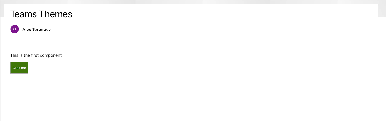
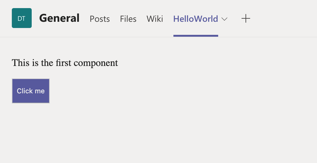
}And now our component looks much better in Teams:
5. Override Global Office UI Fabric Styles
So, custom components now look good in Teams. But if you use Office UI Fabric (OUIFR) components - they still don't respect Teams themes.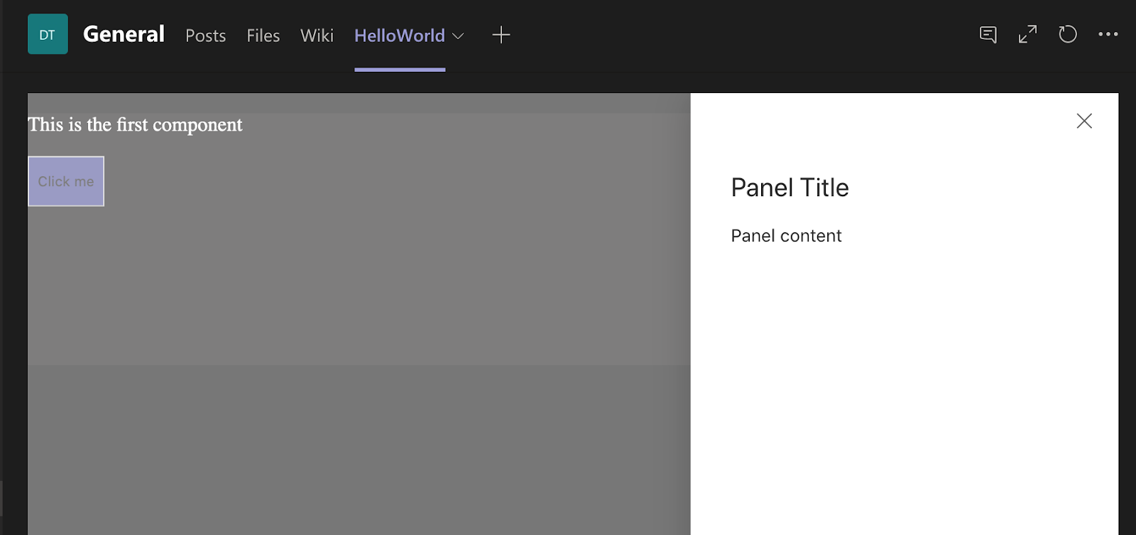
To override all the styles correctly, you'll need to figure out what OUIFR components are used and what classes they have.
For example, we use Panel component. This component use such classes as ms-Layer, ms-Panel, ms-Overlay and so on.
Next step is to analyze DOM element with which class sets applies color styles (backgrounds, borders, font colors, shadows, etc.)
Doing that for the Panel in our example we'll figure out that we need to override:
- .ms-Fabric
- .ms-Button-icon
- .ms-Overlay
- .ms-Panel-main
- .ms-Panel-headerText
But first, let's add variables that will be used in the overrides into _colors.module.scss. Again, you can get most of the colors from SharePoint Theme Generator. If some values do exist in window.__themeState__.theme but not in the Generator then just switch SharePoint site theme to the one that is close enough to Teams theme and get values from there.
//SharePoint
$overlay: "[theme:whiteTranslucent40, default:rgba(255, 255,255, 0.4)]";
$surfaceBackground: "[theme:white, default:#fff]";
$primaryText: "[theme:primaryText, default:#333]";
$panelBorder: "[theme: neutralLight, default: #eaeaea]";

// default theme
$default-overlay: rgba(255, 255, 255, 0.4);
$default-surfaceBackground: #f3f2f1;
$default-primaryText: #252423;
$default-panelBorder: #dedddc;

// dark theme
$dark-overlay: rgba(37, 36, 35, 0.75);
$dark-surfaceBackground: #2d2c2c;
$dark-primaryText: #ffffff;
$dark-panelBorder: #4c4b4b;

// contrast theme
$contrast-overlay: rgba(37, 36, 35, 0.75);
$contrast-surfaceBackground: #000000;
$contrast-primaryText: #ffffff;$contrast-panelBorder: #4c4b4b;
Global.default.module.scss
@import './colors.module';
[data-theme='default'] {
    :global {
        .ms-Fabric {
            color: $default-primaryText;
        }
        .ms-Button-icon {
            color: $default-primaryText;
        }

        .ms-Overlay {
            background-color: $default-overlay;
        }

        .ms-Panel-main {
            background-color: $default-surfaceBackground;
            border-left-color: $default-panelBorder;
            border-right-color: $default-panelBorder;
            .ms-Panel-headerText {
                color: $default-primaryText;
            }
        }
    }
}
Global.dark.module.scss
@import './colors.module';
[data-theme='dark'] {
    :global {
        .ms-Fabric {
            color: $dark-primaryText;
        }
        .ms-Button-icon {
            color: $dark-primaryText;
        }
        .ms-Overlay {
            background-color: $dark-overlay;
        }

        .ms-Panel-main {
            background-color: $dark-surfaceBackground;
            border-left-color: $dark-panelBorder;
            border-right-color: $dark-panelBorder;
            .ms-Panel-headerText {
                color: $dark-primaryText;
            }
        }
    }
}
Global.contrast.module.scss
@import './colors.module';
[data-theme='contrast'] {
    :global {
        .ms-Fabric {
            color: $contrast-primaryText;
        }
        .ms-Button-icon {
            color: $contrast-primaryText;
        }
        .ms-Overlay {
            background-color: $contrast-overlay;
        }

        .ms-Panel-main {
            background-color: $contrast-surfaceBackground;
            border-left-color: $contrast-panelBorder;
            border-right-color: $contrast-panelBorder;
            .ms-Panel-headerText {
                color: $contrast-primaryText;
            }
        }
    }
}@import '../../../common/Global.dark.module.scss';
@import '../../../common/Global.default.module.scss';
@import '../../../common/Global.contrast.module.scss';
6. Don't Forget About Web Part Property Pane!
One component that still looks ugly is Web Part Property Pane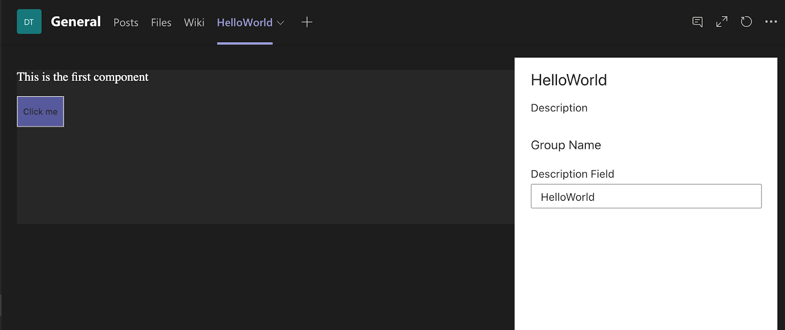
And, unfortunately, it doesn't have any global classes we can override. Only .spPropertyPaneContainer.
But of course we can use other CSS selectors.
Again, let's define all the colors first in our _colors.module.scss:
// SharePoint
$white: "[theme:white, default: #fff]"; // property pane background
$inputBackground: "[theme:inputBackground, default:#fff]"; //input background
$inputBorder: "[theme:inputBorder, default:#a6a6a6]"; // input border
$inputBorderHovered: "[theme:inputBorderHovered, default:#333333]"; // input border hovered

// default theme
$default-white: #f3f2f1;
$default-inputBackground: #fff;
$default-inputBorder: #b5b4b2;
$default-inputBorderHovered: #252423;

// dark-theme
$dark-white: #2d2c2c;
$dark-inputBackground: #000;
$dark-inputBorder: #c8c8c8;
$dark-inputBorderHovered: #ffffff;

//contrast theme
$contrast-white: #000000;
$contrast-inputBackground: #000;
$contrast-inputBorder: #c8c8c8;
$contrast-inputBorderHovered: #ffffff;// Property Pane
.spPropertyPaneContainer {
background-color: $default-white;
[class^="propertyPane_"] {
background-color: $default-white;
border-left-color: $default-panelBorder;
[class^="propertyPanePageTitle_"],
[class^="propertyPanePageDescription_"],
[class^="propertyPaneGroupHeaderNoAccordion_"] {
color: $default-primaryText;
}
.ms-Button--icon {
&:hover {
background-color: transparent;
}
}
}
}
// Text Field
.ms-Label {
color: $default-primaryText;
}
.ms-TextField {
.ms-TextField-fieldGroup {
background-color: $default-inputBackground;
color: $default-primaryText;
border-color: $default-inputBorder;
.ms-TextField-field {
color: $default-primaryText;
}
&:hover {
border-color: $default-inputBorderHovered;
}
}
}Global.dark.module.scss
// Property Pane
.spPropertyPaneContainer {
    background-color: $dark-white;
    [class^="propertyPane_"] {
        background-color: $dark-white;
        border-left-color: $dark-panelBorder;
        [class^="propertyPanePageTitle_"],
        [class^="propertyPanePageDescription_"],
        [class^="propertyPaneGroupHeaderNoAccordion_"] {
            color: $dark-primaryText;
        }
        .ms-Button--icon {
            &:hover {
                background-color: transparent;
            }
        }
    }
}

// Text Field
.ms-Label {
    color: $dark-primaryText;
}
.ms-TextField {
    .ms-TextField-fieldGroup {
        background-color: $dark-inputBackground;
        color: $dark-primaryText;
        border-color: $dark-inputBorder;
        .ms-TextField-field {
            color: $dark-primaryText;
        }
        &:hover {
            border-color: $dark-inputBorderHovered;
        }
    }
}
Global.contrast.module.scss
// Property Pane
.spPropertyPaneContainer {
background-color: $contrast-white;
[class^="propertyPane_"] {
background-color: $contrast-white;
border-left-color: $contrast-panelBorder;
[class^="propertyPanePageTitle_"],
[class^="propertyPanePageDescription_"],
[class^="propertyPaneGroupHeaderNoAccordion_"] {
color: $contrast-primaryText;
}
.ms-Button--icon {
&:hover {
background-color: transparent;
}
}
}
}
// Text Field
.ms-Label {
color: $contrast-primaryText;
}
.ms-TextField {
.ms-TextField-fieldGroup {
background-color: $contrast-inputBackground;
color: $contrast-primaryText;
border-color: $contrast-inputBorder;
.ms-TextField-field {
color: $contrast-primaryText;
}
&:hover {
border-color: $contrast-inputBorderHovered;
}
}
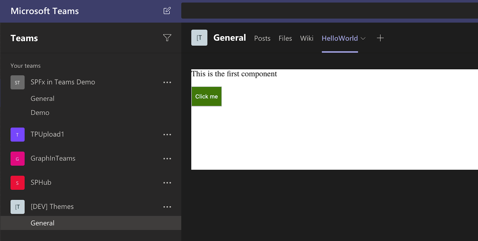
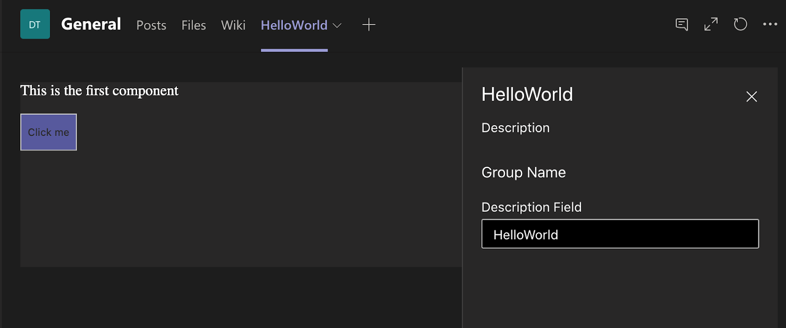
}Yay! Now all the parts of our web part look amazing:
Conclusion
As you can see it takes time to support MS Teams team in your SharePoint Framework web part. Even if you have a single component in there. Imagine how long it will take to add support for 50 components.So, I would recommend to add support in the moment when you develop each component. It will be much easier and not so painful.
Hopefully, this post will also reduce the time you spend to support Teams themes in your SPFx solutions.
The code sample for this post can be found here.
That's all for today!
Have fun!
Comments