
This blog post is based on SPFx web part sample that shows how to use PnP Field Controls to render different types of SharePoint columns in ListView control.
Objective
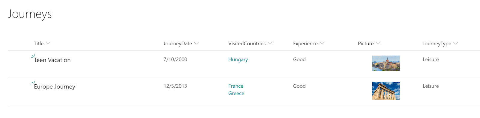
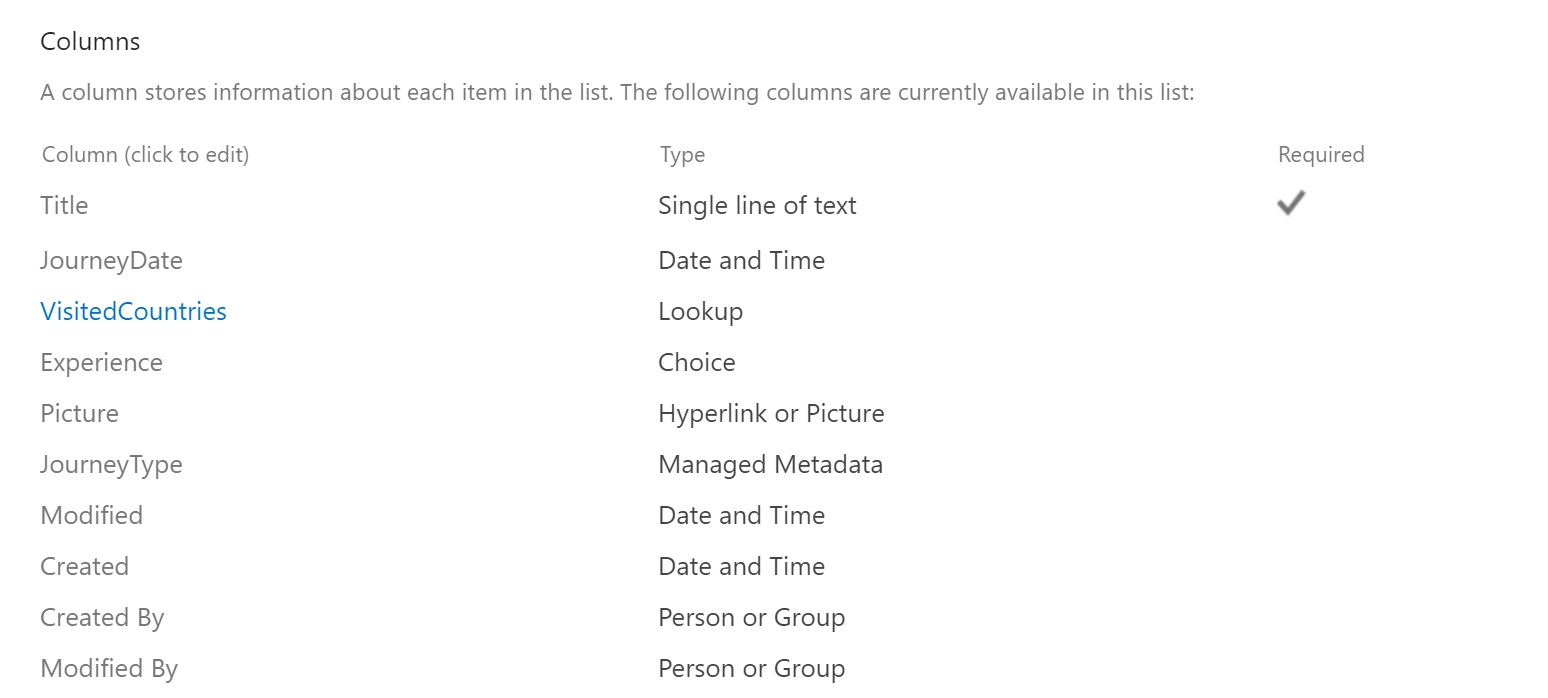
Let's say we have a SharePoint list with such columns as Lookup, Choice, Hyperlink or Picture, etc. And we want to display items from this list in our SPFx web part.In this blog post I will use the list as shown below:
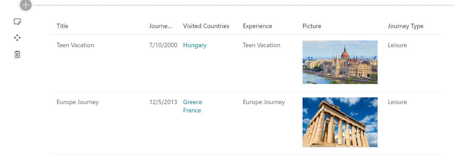
We want to display this list in our web part similarly to the OOTB rendering.
Getting the Items
First thing to do - we need to request the list items from SharePoint.There are several way how you can do that:
- Using SharePoint REST API
- Using Microsoft Graph
- Using PnPJS library
npm i --save @pnp/spimport { sp } from '@pnp/sp';
import '@pnp/sp/webs';
import '@pnp/sp/lists';
import '@pnp/sp/items';private _items: any[];
protected async onInit(): Promise<void> {
await super.onInit();
sp.setup({
spfxContext: this.context
});
const countries = await sp.web.lists.getByTitle('Country').items.get(); // getting Country items to get lookup values
this._items = await sp.web.lists.getByTitle('Journeys').getItemsByCAMLQuery({
ViewXml: ''
});
// getting lookup values by ids
this._items.forEach(item => {
const visitedCountriesIds: number[] = item['VisitedCountriesId'] as number[];
item['VisitedCountries'] = countries.filter(c => visitedCountriesIds.indexOf(c['ID']) !== -1).map(c => c['Title']);
});
}[
{
"Title": "Teen Vacation",
"JourneyDate": "2000-07-10T00:00:00",
"VisitedCountriesId": [
5
],
"Experience": "Good",
"Picture": {
"Description": "Hungray",
"Url": "https://www.coe.int/documents/14577325/16404142/HUN_publication_report/6bac7580-94d7-1cf7-ba59-d3c74228fbad?t=1569512959000"
},
"JourneyType": {
"Label": "Leisure",
"TermGuid": "2262759a-0902-4ec6-87e0-910abb935f59",
"WssId": 1
},
"VisitedCountries": [
"Hungary"
]
},
{
"Title": "Europe Journey",
"JourneyDate": "2013-12-05T00:00:00",
"VisitedCountriesId": [
6,
3
],
"Experience": "Good",
"Picture": {
"Description": "greece",
"Url": "https://static.coindesk.com/wp-content/uploads/2018/10/greece-1594689_1920-710x458.jpg?format=webp"
},
"JourneyType": {
"Label": "Leisure",
"TermGuid": "2262759a-0902-4ec6-87e0-910abb935f59",
"WssId": 1
},
"VisitedCountries": [
"Greece",
"France"
]
}
]PnP ListView
PnP ListView component allows you to render collection of items. It is based on Office UI Fabric React DetailsList and allow to render items similarly to Office 365 experience.You have to provide a list of view fields as IViewField[] that describes what columns to render and list of items as any[]. You can read documentation on these parameters here.
The problem with this controls is that it flattens the passed items. And for our example, for VisitedCountries it will create a separate property for each array member:
{
  "VisitedCountries.0": "Greece",
  "VisitedCountries.1": "France"
}Good thing is - we can define render function for each column and provide custom rendering for a cell there.
Field Controls
PnP Field Controls were initially created to be used in SPFx Field Customizers to provide rendering of the fields similar to out of the box experience.But technically we can use them in web parts as well. And, as a result, we can use them to provide custom rendering for ListView cells.
Combining Everything
So, let's use Field Controls in our ListView.And first thing - add all needed imports:
import { ListView, IViewField } from '@pnp/spfx-controls-react/lib/ListView';
import { FieldTextRenderer } from '@pnp/spfx-controls-react/lib/FieldTextRenderer';
import { FieldDateRenderer } from '@pnp/spfx-controls-react/lib/FieldDateRenderer';
import { FieldLookupRenderer } from '@pnp/spfx-controls-react/lib/FieldLookupRenderer';
import { FieldUrlRenderer } from '@pnp/spfx-controls-react/lib/FieldUrlRenderer';
import { FieldTaxonomyRenderer } from '@pnp/spfx-controls-react/lib/FieldTaxonomyRenderer';
import { ISPFieldLookupValue } from '@pnp/spfx-controls-react/lib/Common';private _renderTitle(item?: any): any {
return <FieldTextRenderer
text={item.Title}
/>;
}
private _renderExperience(item?: any): any {
const experience = item['Expirience'];
return <FieldTextRenderer
text={experience}
/>;
}private _renderDate(item?: any): any {
const date = new Date(item['JourneyDate']);
return <FieldDateRenderer
text={date.toLocaleDateString()} />;
}private _renderPicture(item?: any): any {
return <FieldUrlRenderer
url={item['Picture.Url']}
isImageUrl={true}
className={styles.image}
text={item['Picture.Description'] || ''} />;
}private _renderJourneyType(item?: any) {
return <FieldTaxonomyRenderer
terms={[{
Label: item['JourneyType.Label'],
TermID: item['JourneyType.TermGuid']
}]} />;
}private _renderCountries(item?: any, index?: number): any {
//
// ListView item contains "flattened" information
// So, we're getting original item first
//
const originalItem = this.props.items[index!];
const visitedCountriesIds = originalItem['VisitedCountriesId'];
const visitedCountries = originalItem['VisitedCountries'];
const lookups: ISPFieldLookupValue[] = visitedCountries.map((vc, idx) => {
return {
lookupId: visitedCountriesIds[idx].toString(),
lookupValue: vc
};
});
return <FieldLookupRenderer
lookups={lookups}
onClick={args => {
this.setState({
selectedLookupId: args.lookup.lookupId
});
}} />;
}import { IFrameDialog } from '@pnp/spfx-controls-react/lib/IFrameDialog';
import { DialogType } from 'office-ui-fabric-react/lib/Dialog';
//...
public render(): React.ReactElement<IPnPListViewProps> {
//...
{this.state.selectedLookupId &&
<IFrameDialog
hidden={false}
url={`${this.props.context.pageContext.web.absoluteUrl}${this._lookupFieldDispWebRelativeUrl.replace('{0}', this.state.selectedLookupId.toString())}`}
iframeOnLoad={iframe => {
const iframeWindow: Window = iframe.contentWindow;
const iframeDocument: Document = iframeWindow.document;
const s4Workspace: HTMLDivElement = iframeDocument.getElementById('s4-workspace') as HTMLDivElement;
s4Workspace.style.height = iframe.style.height;
s4Workspace.scrollIntoView();
}}
onDismiss={() => {
this.setState({
selectedLookupId: undefined
});
}}
modalProps={{
isBlocking: true
}}
dialogContentProps={{
type: DialogType.close,
showCloseButton: true
}}
width={'570px'}
height={'250px'} />}
//...
}The final code of the component:
export default class PnPListView extends React.Component<IPnPListViewProps, IPnPListViewState> {
private readonly _countriesLookupFieldId = '5e037cea-aaef-40dd-895f-90442114016f';
private readonly _lookupFieldDispWebRelativeUrl = '/Lists/Country/DispForm.aspx?ID={0}&RootFolder=*&IsDlg=1';
private readonly _fields: IViewField[] = [{
name: 'Title',
displayName: 'Title',
minWidth: 150,
maxWidth: 250,
render: this._renderTitle
}, {
name: 'JourneyDate',
displayName: 'Journey Date',
render: this._renderDate
}, {
name: 'VisitedCountries',
displayName: 'Visited Countries',
minWidth: 100,
render: (item, index) => { return this._renderCountries(item, index); }
}, {
name: 'Experience',
displayName: 'Experience',
minWidth: 100,
render: this._renderExperience
}, {
name: 'Picture',
displayName: 'Picture',
minWidth: 150,
render: this._renderPicture
}, {
name: 'JourneyType',
displayName: 'Journey Type',
minWidth: 100,
render: this._renderJourneyType
}];
constructor(props: IPnPListViewProps) {
super(props);
this.state = {};
}
public render(): React.ReactElement<IPnPListViewProps> {
return (
<div className={styles.pnPListView}>
<ListView items={this.props.items} viewFields={this._fields} />
{this.state.selectedLookupId &&
<IFrameDialog
hidden={false}
url={`${this.props.context.pageContext.web.absoluteUrl}${this._lookupFieldDispWebRelativeUrl.replace('{0}', this.state.selectedLookupId.toString())}`}
iframeOnLoad={iframe => {
const iframeWindow: Window = iframe.contentWindow;
const iframeDocument: Document = iframeWindow.document;
const s4Workspace: HTMLDivElement = iframeDocument.getElementById('s4-workspace') as HTMLDivElement;
s4Workspace.style.height = iframe.style.height;
s4Workspace.scrollIntoView();
}}
onDismiss={() => {
this.setState({
selectedLookupId: undefined
});
}}
modalProps={{
isBlocking: true
}}
dialogContentProps={{
type: DialogType.close,
showCloseButton: true
}}
width={'570px'}
height={'250px'} />}
</div>
);
}
/**
* Title column renderer
* @param item ListView item
*/
private _renderTitle(item?: any): any {
return <FieldTextRenderer
text={item.Title}
/>;
}
/**
* Date column renderer
* @param item ListView item
*/
private _renderDate(item?: any): any {
  const date = new Date(item['JourneyDate']);
  return <FieldDateRenderer
    text={date.toLocaleDateString()} />;
}
/**
* Countries (Multi Lookup) column renderer
* @param item ListView item
* @param index item index
*/
private _renderCountries(item?: any, index?: number): any {
//
// ListView item contains "flattened" information
// So, we're getting original item first
//
const originalItem = this.props.items[index!];
const visitedCountriesIds = originalItem['VisitedCountriesId'];
const visitedCountries = originalItem['VisitedCountries'];
const lookups: ISPFieldLookupValue[] = visitedCountries.map((vc, idx) => {
return {
lookupId: visitedCountriesIds[idx].toString(),
lookupValue: vc
};
});
return <FieldLookupRenderer
lookups={lookups}
onClick={args => {
this.setState({
selectedLookupId: args.lookup.lookupId
});
}} />;
}
/**
* Experience (Choice) column renderer
* @param item ListView item
*/
private _renderExperience(item?: any): any {
const experience: string = item['Expirience'];
return <FieldTextRenderer
text={experience}
/>;
}
/**
* Picture (Hyperlink or Picture) column renderer
* @param item ListView item
*/
private _renderPicture(item?: any): any {

  return <FieldUrlRenderer
    url={item['Picture.Url']}
    isImageUrl={true}
    className={styles.image}
    text={item['Picture.Description'] || ''} />;
}
/**
* JourneyType (Managed Metadata) column renderer
* @param item ListView item
*/
private _renderJourneyType(item?: any) {

  return <FieldTaxonomyRenderer
    terms={[{
      Label: item['JourneyType.Label'],
      TermID: item['JourneyType.TermGuid']
    }]} />;
  }
}
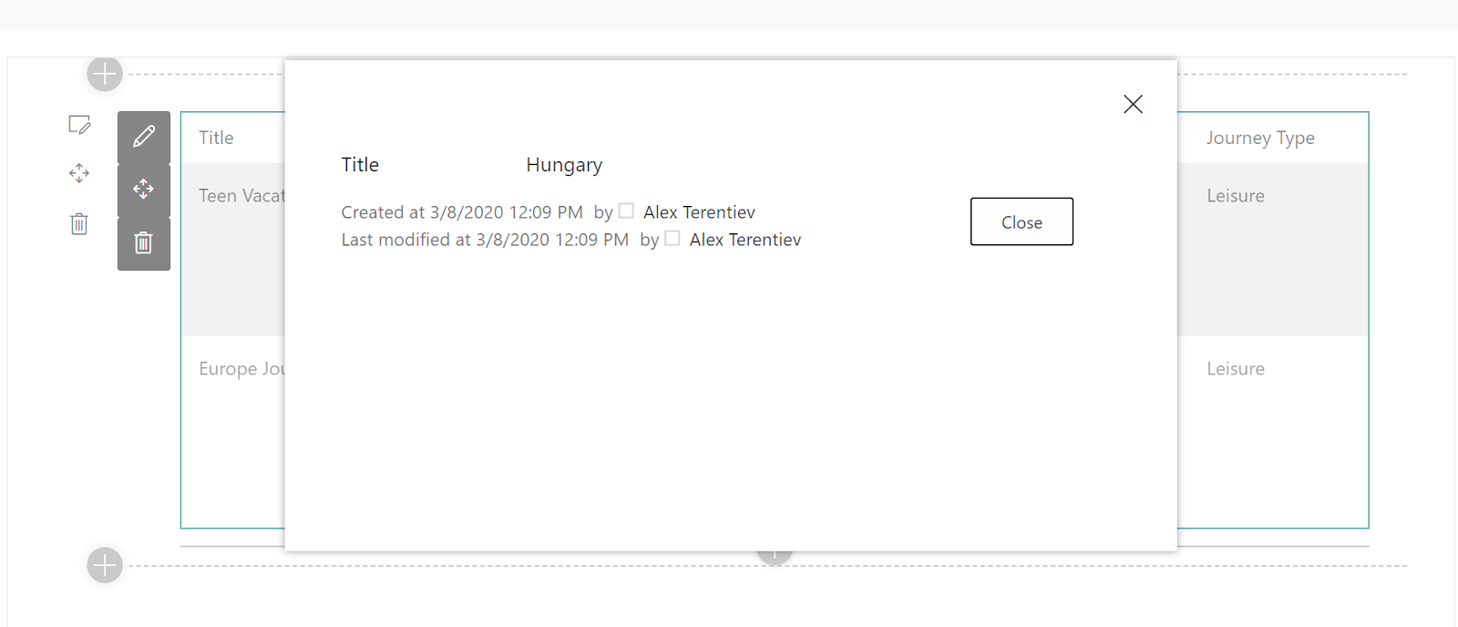
And lookup popup:
Conclusion
As you can see it's pretty easy to combine different PnP Reusable Controls to work together. Using the same technique you can render other SharePoint column types like People or Group, multiline text, and others.As mentioned in the beginning of the post, you can find all the code here
That's all for today!
Have fun! for today!
Have fun!
Comments