
This is the second post about SharePoint Framework and Vue.js. In this post I'm going to implement basic Client-Side Web Part using Vue.js - basically, "wrap" the markup from Web Part template project with Vue.js component.
List of posts:
- Whats and Whys
- Default SPFx web part using Vue.js (this post)
- Yeoman Generator with Vue Support
- Web Part Property Pane Control
- Use React Components inside Vue.js Solution
Now let's go further and include Vue.js in SharePoint Framework project
1. Scaffolding
So, the first thing we should do, as with any other SPFx project, is to "scaffold" it from the template how it is described hereThis will create a basic project with a markup implemented using HTML with no framework used.
Now we have a SPFx project prepared and the goal is to replace the HTML markup with a Vue component.
2. Including Vue into the Project
I'm going to implement a web part as a Single File Component (SFC) with a help of vue-class-component. This is one of two available options how to implement an SFC using Vue.js. Another one is to use Vue.extend which is more "classic" way for Vue developers. But vue-class-component is more similar to SPFx development itself. So, as mentioned, I'll use this one.First of all, we need to install vue module as we did in the first post:
npm i --save vueAdditionally, we need ts-loader and sass-loader to correctly process TypeScript code and SCSS styles inside SFCs.
We need these modules for bundling only. That's why we'll install them with --save-dev parameter:
npm i --save-dev vue-loader vue-template-compiler sass-loader ts-loadernpm i --save vue-class-component vue-property-decoratorBy default, ts-loader creates additional assets that are not recognized by SharePoint Framework in release mode. It leads to errors in gulp bundle --ship command and inability to package the solution.
To avoid that we can use transpileOnly: true option of ts-loader (see Webpack config modifications below). But it leads to disabling of type and syntactic checking inside .vue files.
To keep the checking we can use fork-ts-checker-webpack-plugin:
npm i --save-dev fork-ts-checker-webpack-pluginnpm i --save vue vue-class-component vue-property-decorator
npm i --save-dev vue-loader vue-property-decorator sass-loader ts-loader fork-ts-checker-webpack-plugin3. Modifying Webpack config and Gulp tasks
Next step is to modify gulpfile.js. We need to change multiple things to build our Vue components correctly:- Copy Vue files to the destination folder.
- apply correct loaders for .vue files
For that we can create a Gulp sub task and add it after the TypeScript compiler task:
let copyVueFiles = build.subTask('copy-vue-files', function(gulp, buildOptions, done){
  return gulp.src(['src/**/*.vue'])
           .pipe(gulp.dest(buildOptions.libFolder))
});
build.rig.addPostTypescriptTask(copyVueFiles);For that we can use next flow: add watch task on .vue files. When watch fires event that the files has been saved we're copying empty index.ts file from src folder to itself. It will kick of the build process.
Thanks to Stefan Bauer for the idea.
// marker to check if custom watch is already registered
// used to prevent watch bubbling
let customWatchRegistered = false;

let watchVueFiles = build.subTask('watch-vue-files', function (gulp, buildOptions, done) {
    // register watch only on first run
    if (!customWatchRegistered) {

        // on change of *.vue files
        gulp.watch('./src/**/*.vue', event => {
            // copy empty index.ts onto itself to launch build procees
            gulp.src('./src/index.ts')
                .pipe(gulp.dest('./src/'));
        });

        // after watch is registered don't register again
        customWatchRegistered = true;

    }

    done();
});

build.rig.addPreBuildTask(watchVueFiles);// Merge custom loader to web pack configuration
build.configureWebpack.mergeConfig({
additionalConfiguration: (generatedConfiguration) => {
const VueLoaderPlugin = require('vue-loader/lib/plugin');
const ForkTsCheckerWebpackPlugin = require('fork-ts-checker-webpack-plugin');
const vuePlugin = new VueLoaderPlugin();
const forkTsPlugin = new ForkTsCheckerWebpackPlugin({
vue: true,
tslint: true,
formatter: 'codeframe',
checkSyntacticErrors: false
});
const loadersConfigs = [{
test: /\.vue$/, // vue
use: [{
loader: 'vue-loader'
}]
}, {
resourceQuery: /vue&type=script&lang=ts/, // typescript
loader: 'ts-loader',
options: {
appendTsSuffixTo: [/\.vue$/],
transpileOnly: true
}
}, {
resourceQuery: /vue&type=style.*&lang=scss/, // scss
use: [
{
loader: require.resolve('@microsoft/loader-load-themed-styles'),
options: {
async: true
}
},
{
loader: 'css-loader',
options: {
modules: true,
localIdentName: '[local]_[sha1:hash:hex:8]'
}
},
'sass-loader']
}, {
resourceQuery: /vue&type=style.*&lang=sass/, // sass
use: [
{
loader: require.resolve('@microsoft/loader-load-themed-styles'),
options: {
async: true
}
},
{
loader: 'css-loader',
options: {
modules: true,
localIdentName: '[local]_[sha1:hash:hex:8]'
}
},
'sass-loader?indentedSyntax']
}];
generatedConfiguration.plugins.push(vuePlugin, forkTsPlugin);
generatedConfiguration.module.rules.push(...loadersConfigs);
return generatedConfiguration;
}
});First, we're instantiating 2 plugins:
- VuePlugin to correctly kick off processing of .vue files by vue-loader and
- ForkTsCheckerWebpackPlugin to check typings in .vue files and use tslint rules for syntactical checking
- vue-loader to process .vue files
- ts-loader to process TypeScript code from .vue files. The interesting thing here is that we don't want to process .ts files with ts-loader. To avoid that we're using resourceQuery rule to process only code from files that have vue&type=script&lang=ts in query string parameters. These parameters are added by vue-loader for <script lang="ts"> blocks
- For<style> blocks we're adding multiple loaders to work sequentially: @microsoft/loader-load-themed-styles loader to process theme variables;css-loader to be able to use CSS Modules; and sass-loader to process scss or sass if needed.
4. Implementing Vue Single File Component
Now we're ready to implement web part's markup as a Vue SFC.For that let's create components folder, SimpleWebPart subfolder, and SimpleWebPart.vue file in it.
Now let's move the markup from the Web Part .ts file to .vue file.
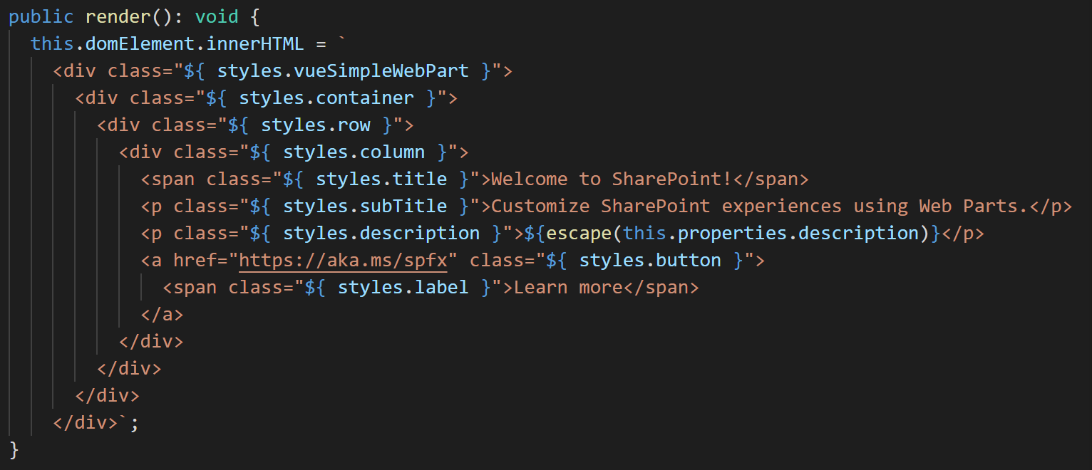
The markup (HTML) should be placed inside template element. So, after copying, the .vue file should look like this:
<template>
    <div class="${ styles.vueSimpleWp }">
        <div class="${ styles.container }">
            <div class="${ styles.row }">
                <div class="${ styles.column }">
                    <span class="${ styles.title }">Welcome to SharePoint!</span>
                    <p class="${ styles.subTitle }">Customize SharePoint experiences using Web Parts.</p>
                    <p class="${ styles.description }">${escape(this.properties.description)}</p>
                    <a href="https://aka.ms/spfx" class="${ styles.button }">
                        <span class="${ styles.label }">Learn more</span>
                    </a>
                </div>
            </div>
        </div>
    </div>
</template>For that we need to add <script lang="ts"> section in .vue file and add our TypeScript code there. The code should contain a "component" class (marked with @Component attribute and extend Vue interface.
To be more close to SPFx development standarts, I will also define ISimpleWebPartProps interface to contain component's properties declaration:
<script lang="ts">
import { Vue, Component, Prop, Provide } from 'vue-property-decorator';

/**
 * Component's properties
 */
export interface ISimpleWebPartProps {
    description: string;
}

/**
 * Class-component
 */
@Component
export default class SimpleWebPart extends Vue implements ISimpleWebPartProps {

    /**
     * implementing ISimpleWebPartProps interface
     */
    @Prop()
    public description: string;
}
</script><script src="./YourFile.ts">
</script>For that we need to use mustache syntax and replace ${escape(this.properties.description)} with {{description}}:
<p class="${ styles.description }">{{description}}</p>One change to be done in copied styles is to change @import statement: file name should be changed from SPFabricCore.scss to _SPFabricCore.scss. The reason for that is that physically there is no SPFabricCore.scss file in SP Office UI Fabric Core module. This name is process by custom SharePoint Framework Gulp task and resolved correctly to actual file _SPFabricCore.scss. In our case we don't have access to that custom Gulp task and need to reference actual file directly.
The code in style section should look like that:
<style lang="scss" module>
@import "~@microsoft/sp-office-ui-fabric-core/dist/sass/_SPFabricCore.scss";

.vueSimpleWp {
  .container {
    max-width: 700px;
    margin: 0px auto;
    box-shadow: 0 2px 4px 0 rgba(0, 0, 0, 0.2), 0 25px 50px 0 rgba(0, 0, 0, 0.1);
  }

  .row {
    @include ms-Grid-row;
    @include ms-fontColor-white;
    background-color: $ms-color-themeDark;
    padding: 20px;
  }

  .column {
    @include ms-Grid-col;
    @include ms-lg10;
    @include ms-xl8;
    @include ms-xlPush2;
    @include ms-lgPush1;
  }

  .title {
    @include ms-font-xl;
    @include ms-fontColor-white;
  }

  .subTitle {
    @include ms-font-l;
    @include ms-fontColor-white;
  }

  .description {
    @include ms-font-l;
    @include ms-fontColor-white;
  }

  .button {
    // Our button
    text-decoration: none;
    height: 32px;

    // Primary Button
    min-width: 80px;
    background-color: $ms-color-themePrimary;
    border-color: $ms-color-themePrimary;
    color: $ms-color-white;

    // Basic Button
    outline: transparent;
    position: relative;
    font-family: "Segoe UI WestEuropean", "Segoe UI", -apple-system,
      BlinkMacSystemFont, Roboto, "Helvetica Neue", sans-serif;
    -webkit-font-smoothing: antialiased;
    font-size: $ms-font-size-m;
    font-weight: $ms-font-weight-regular;
    border-width: 0;
    text-align: center;
    cursor: pointer;
    display: inline-block;
    padding: 0 16px;

    .label {
      font-weight: $ms-font-weight-semibold;
      font-size: $ms-font-size-m;
      height: 32px;
      line-height: 32px;
      margin: 0 4px;
      vertical-align: top;
      display: inline-block;
    }
  }
}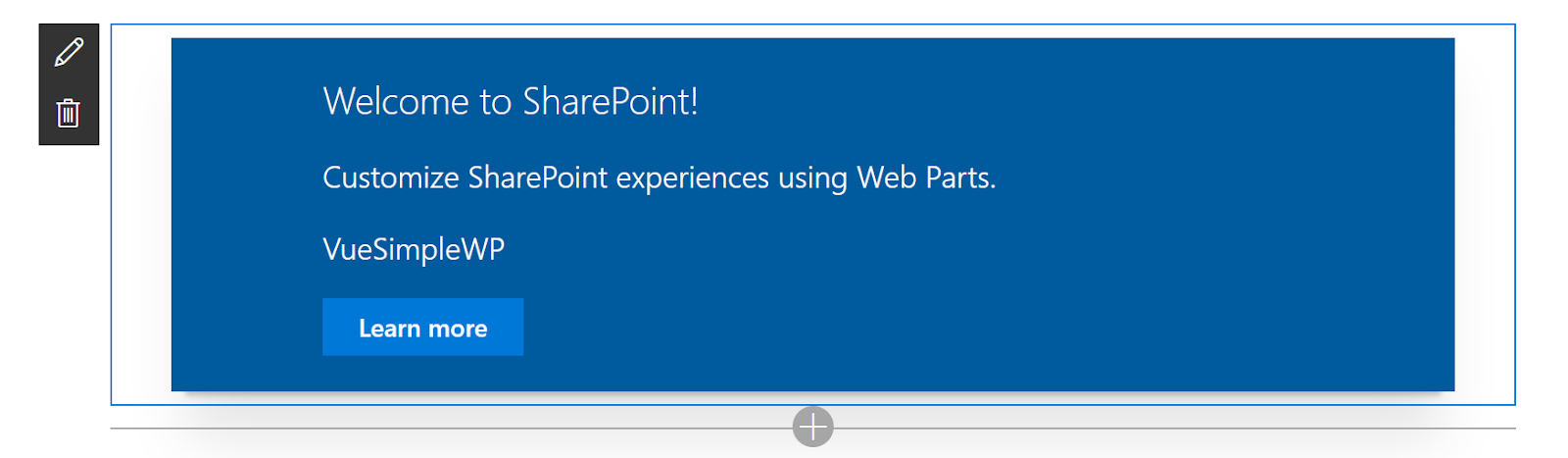
</style>Now the styles can be used in the template (in markup) using pre-defined $style variable:
<template>
    <div :class="$style.vueSimpleWp">
        <div :class="$style.container">
            <div :class="$style.row">
                <div :class="$style.column">
                    <span :class="$style.title">Welcome to SharePoint!</span>
                    <p :class="$style.subTitle">Customize SharePoint experiences using Web Parts.</p>
                    <p :class="$style.description">{{description}}</p>
                    <a href="https://aka.ms/spfx" :class="$style.button">
                        <span :class="$style.label">Learn more</span>
                    </a>
                </div>
            </div>
        </div>
    </div>
</template>5. Adding Vue SFC Component in Web Part
The last step is to add created element instead default HTML in the Web Part.For that, let's import Vue object, our component and the properties:
import Vue from 'vue';
import SimpleWebPart, { IVueSimpleWpWebPartProps } from './components/SimpleWebPart/SimpleWebPart.vue';public render(): void {
const id: string = `wp-${this.instanceId}`;
this.domElement.innerHTML = `<div id="${id}"></div>`;
let el = new Vue({
el: `#${id}`,
render: h => h(SimpleWebPartComponent, {
props: {
description: this.properties.description
}
})
});
}Usually it's not a good idea to use ids for any references, but here I've tried to reference directly this.domElement in the Vue constructor. But in that case "reactive" change of web part's properties will not work.
So I decided to go with id.
If you have any other ideas - feel free to share!
Now, if you try to compile the project with gulp command, you'll receive the error
Error - typescript - src/webparts/vueSimpleWp/VueSimpleWpWebPart.ts(16,35): error TS2307: Cannot find module './components/SimpleWebPart/SimpleWebPart.vue'.To notify TypeScript about the structure of .vue files (and modules) we need to add vue-shims.d.ts file in the src folder with the next content:
// src/vue-shims.d.ts

declare module "*.vue" {
    import Vue from "vue";
    export default Vue;
}
The code for this example is available here
That's it for now!
Have fun and stay tuned!
Comments