
This is the fourth post about SharePoint Framework and Vue.js. In this post I want to go through the process of creation custom Property Pane control using Vue.js.
List of posts:
- Whats and Whys
- Default SPFx web part using Vue.js
- Yeoman generator with Vue support
- Web Part Property Pane Control (this post)
- Use React Components inside Vue.js Solution
In previous posts we discussed what steps are needed to make Vue.js work in SPFx projects and how to use Vue.js Single File Components inside SharePoint Framework Web Parts and Extensions.
I've also mentioned Yeoman VueSpfx generator that does all needed configurations.
In the current post I want to discuss how to create custom controls for Web Part Property Pane.
Files and Structure
If you look at official documentation and Reusable SPFx Property Pane Controls repo you'll notice that there is a "best practice" on how to structure files and code of custom controls for property pane when you're going to use some JavaScript framework.Note: I'm using "component" and "control" terms here. The "control" is for property pane custom control that we're creating. The "component" is for framework-specific implementation of the control.
Let's say you want to create new ImageUrl control which is a simple input (text box). In that case the file structure and contents will look like that:
- IPropertyFieldImageUrl.ts - file to contain custom control properties interface ("public" properties) that will be passed from the web part. This file also usually contains "internal" properties interface that extends "public" properties with IPropertyPaneCustomFieldProps interface.
"Public" properties interface usually contains:- key - a UNIQUE key indicates the identity of this control.
- properties - parent Web Part properties
- onPropertyChange - defines an onPropertyChange function to raise when the selected value changes. Normally this function must be defined with the 'this.onPropertyChange' method of the web part object.
import { IPropertyPaneCustomFieldProps } from '@microsoft/sp-webpart-base'; export interface IPropertyFieldImageUrlProps { key: string; properties: any; onPropertyChange(propertyPath: string, oldValue: any, newValue: any): void; // other needed properties } export interface IPropertyFieldImageUrlPropsInternal extends IPropertyFieldImageUrlProps, IPropertyPaneCustomFieldProps { } - IPropertyfieldImageUrlHost.ts - file with interfaces that are needed for the component's functioning. In case of React it will contain Props and State interfaces.
For Vue.js we can define Props interface in this file. That interface will be used as a "contract" for our SFC. - PropertyFieldImageUrl.ts - custom control "entry point". It contains
- A function to create the control (this function will be used in getPropertyPaneConfiguration method of the web part).
- A "builder" class that is needed to correctly initialize, render and "orchestrate" the component. This class is instantiated from the function mentioned above.
import { IPropertyPaneField, PropertyPaneFieldType } from '@microsoft/sp-webpart-base'; import { IPropertyFieldImageUrlProps, IPropertyFieldImageUrlPropsInternal } from './IPropertyFieldImageUrl'; // other imports to reference component and its properties class PropertyFieldImageUrlBuilder implements IPropertyPaneField<IPropertyFieldImageUrlProps> { // rendering, correct initialization, and so on... } export function PropertyFieldImageUrl(targetProperty: string, properties: IPropertyFieldImageUrlProps): IPropertyPaneField<IPropertyFieldImageUrlProps> { return new PropertyFieldImageUrlBuilder(targetProperty, properties); } - PropertyFieldImageUrlHost.module.scss - SASS file with all the styles used in the component.
- Framework-specific files for component implementation. In case of React it will be PropertyFieldImageUrlHost.tsx. For Vue.js we'll add PropertyFieldImageUrlHost.vue and remove PropertyFieldImageUrlHost.module.scss as all the styles will be included in .vue file.
Implementation
Now, let's implement the control!General idea of the control is to provide a text box with label that will allow user to enter image url (for example, SharePoint document url) as a simple text. Later, this value could be used in the Web Part to render the image.
It means that we'll need to have to additional properties in "public" properties interface:
- label - to provide the label for the text box. It could be hardcoded or received directly from web part's strings. But let's pass it from the web part.
- value - the value of the text box. This value could be stored in web part's properties.
I'll be describing the implementation based on the files mentioned above.
IPropertyFieldImageUrl.ts
As mentioned above, this file contains "public" and "internal" properties of the control.Let's extend the "public" properties interface to include label and value properties. The "internal" properties interface will remain without changes.
import { IPropertyPaneCustomFieldProps } from '@microsoft/sp-webpart-base';

/**
 * Public properties of the PropertyField custom field
 */
export interface IPropertyFieldImageUrlProps {
    /**
    * An UNIQUE key indicates the identity of this control
    */
    key: string;
    /**
     * Property field label displayed on top
     */
    label: string;
    /**
    * Parent Web Part properties
    */
    properties: any;
    /**
     * Defines an onPropertyChange function to raise when the items order changes.
     * Normally this function must be defined with the 'this.onPropertyChange'
     * method of the web part object.
     */
    onPropertyChange(propertyPath: string, oldValue: any, newValue: any): void;
    /**
     * current value
     */
    value?: string;
}

export interface IPropertyFieldImageUrlPropsInternal extends IPropertyFieldImageUrlProps, IPropertyPaneCustomFieldProps {
}
IPropertyfieldImageUrlHost.ts
This file contains Props interface for Vue.js component. Here we should define all the properties that are passed from the "builder" class. In our case, we need to pass current value, label, unique key and handler to call when the value has been changed in the component:/**
* PropertyFieldHost component props
*/
export interface IPropertyFieldImageUrlHostProps {
label: string;
value?: string;
onValueChanged: (value: string) => void;
/**
* we're using uniqueKey instead of key because key is a "reserved" attribute
*/
uniqueKey: string;
}PropertyFieldImageUrl.vue - <style> Section
The section "duplicates" the styles and hierarchy that is used in TextField Office UI Fabric component. It also uses "theme" variables for border colors (you can read more about theme variables here, here, and here).<style lang="scss" module>
@import '~@microsoft/sp-office-ui-fabric-core/dist/sass/_SPFabricCore.scss';
$inputBorder: "[theme:inputBorder, default: #a6a6a6]";
$inputBorderHovered: "[theme:inputBorderHovered, default: #212121]";
.ImageUrl {
.label {
display: block;
padding: 5px 0;
}
.inputWrapper {
border: 1px solid;
border-color: $inputBorder;
height: 32px;
display: flex;
&:hover {
border-color: $inputBorderHovered;
}
& > input {
border: none;
padding: 0 12px;
width: 100%;
}
}
}
</style>PropertyFieldImageUrlHost.vue - <script> Section
The section contains the logic of Vue.js component.In our simple example we need multiple things here:
- Implement IPropertyFieldImageUrlHost interface as Vue.js "props". Because I'm using vue-property-decorator(NPM package), these properties will be marked with @Prop() decorator (annotation).
- Add "reactive" properties. In our case we'll have single reactive property - current value of the text box.
- Add text box's onchange handler that will be used to bubble the value up to the "builder" and to the web part.
- Few computed properties to be used in the template: styles to reference compiled CSS classes names and inputId for unique text box id.
<script lang="ts">
import { Vue, Component, Prop, Provide } from 'vue-property-decorator';

import {
    IPropertyFieldImageUrlHostProps
} from './IPropertyFieldImageUrlHost';

/**
 * Class-component
 */
@Component
export default class PropertyFieldImageUrlHost extends Vue implements IPropertyFieldImageUrlHostProps {
    @Prop()
    public label: string;

    @Prop()
    public value?: string;

    @Prop()
    public uniqueKey: string;

    @Prop()
    public onValueChanged: (value: string) => void;

    /**
     * reactive properties of the component
     */
    public data(): any {
        return {
            // text box value
            inputValue: this.value
        };
    }

    /**
     * Unique input id
     */
    public get inputId(): string {
        return `Input${this.uniqueKey}`;
    }

    /**
     * input onchange event handler
     * @param event
     */
    private _onChange(event) {
        if (this.onValueChanged) {
            this.onValueChanged(this.$data.inputValue);
        }
    }
}
</script>
PropertyFieldImageUrlHost.vue - <template> Section
This section provides markup of the component with Vue.js bindings to the class-component. The markup here duplicates markup hierarchy of TextField Office UI Fabric component.<template>
<div :class="$style.ImageUrl">
<label :for="inputId" class="ms-Label" :class="$style.label">{{label}}>/label>
<div class="ms-TextField-fieldGroup" :class="$style.inputWrapper">
<input type="text" v-model="inputValue" :id="inputId" v-on:change="_onChange" />
</div>
</div>
</template>- All attributes starting with : or v- are special Vue.js attributes needed for data binding.
- Same statement as above could be applied to values wrapped with mustache syntax {{...}} - similarly to handlebars.js
- v-model attribute is used for form inputs two-way binding.
The statementis equal to<input v-model="searchText">In our situation we could use v-bind:value only and use v-on:input instead of v-on:change because we bubble the input's value up to the web part and call re-render with passing this new value back to the component.<input v-bind:value="searchText" v-on:input="searchText = $event.target.value" >
But I decided to showcase the usage of v-model attribute. And also it assures that even if the value hasn't been passed back, we'll render correct text in the input.
PropertyFieldImageUrl.ts
Now we're ready to implement the last piece of the control: "builder" class.First, let's import Vue and ImageUrlComponent:
// Importing Vue.js
import Vue from 'vue';
// Improting Vue.js SFC
import ImageUrlComponent from './PropertyFieldImageUrlHost.vue';Most of the code is standard: we need to implement IPropertyPaneField interface, add some control-specific fields (in our case - value), correctly initialize the instance in the constructor, add onRender handler that is called to render the control:
class PropertyFieldImageUrlBuilder implements IPropertyPaneField<IPropertyFieldImageUrlProps> {
//Properties defined by IPropertyPaneField
public type: PropertyPaneFieldType = PropertyPaneFieldType.Custom;
public targetProperty: string;
public properties: IPropertyFieldImageUrlPropsInternal;
private elem: HTMLElement;
private value: string;
private changeCB?: (targetProperty?: string, newValue?: any) => void;
public constructor(_targetProperty: string, _properties: IPropertyFieldImageUrlProps) {
this.targetProperty = _targetProperty;
this.properties = {
key: _properties.key,
label: _properties.label,
onPropertyChange: _properties.onPropertyChange,
value: _properties.value,
onRender: this.onRender.bind(this),
properties: _properties.properties
};
this.value = _properties.value;
if (this.value === undefined) {
this.value = '';
}
}
public render(): void {
// TODO: render
}
}For handling the changes we just need to implement a handler method an pass it as onValueChanged a property to our control. The handler method should compare new value with the previous one, update web part's property and fire callbacks to bubble new value to the web part. The code of the handler is also pretty standard:
private _onInputChange(newValue: string): void {
    if (this.properties.onPropertyChange && newValue !== this.value) {
        this.properties.onPropertyChange(this.targetProperty, this.value, newValue);
        this.value = newValue;
        this.properties.properties[this.targetProperty] = newValue;
        if (typeof this.changeCB !== 'undefined' && this.changeCB !== null) {
            this.changeCB(this.targetProperty, newValue);
        }
    }
}
The code for rendering is similar to one described in Default SPFx web part using Vue.js: we need to create Vue component with providing render method to the constructor. This method creates our ImageUrlComponent and passes all needed properties.
The difference with the process described in Default SPFx web part using Vue.js is that we're not providing el property directly in Vue constructor. We're calling $mount method instead.
This is done because parent container for the control might not be added to the actual DOM at the moment when we're creating the instance of Vue. It can exist in Virtual DOM only. In that case Vue.js will throw an error that the element (parent node) is not found. $mount method allows to use "deferred" mounting.
The full code of the file, including described onRender method is listed below.
import { IPropertyPaneField, PropertyPaneFieldType } from '@microsoft/sp-webpart-base';
import { IPropertyFieldImageUrlProps, IPropertyFieldImageUrlPropsInternal } from './IPropertyFieldImageUrl';

// Importing Vue.js
import Vue from 'vue';
// Improting Vue.js SFC
import ImageUrlComponent from './PropertyFieldImageUrlHost.vue';

class PropertyFieldImageUrlBuilder implements IPropertyPaneField<IPropertyFieldImageUrlProps> {
    //Properties defined by IPropertyPaneField
    public type: PropertyPaneFieldType = PropertyPaneFieldType.Custom;
    public targetProperty: string;
    public properties: IPropertyFieldImageUrlPropsInternal;
    private elem: HTMLElement;
    private value: string;
    private changeCB?: (targetProperty?: string, newValue?: any) => void;

    public constructor(_targetProperty: string, _properties: IPropertyFieldImageUrlProps) {
        this.targetProperty = _targetProperty;
        this.properties = {
            key: _properties.key,
            label: _properties.label,
            onPropertyChange: _properties.onPropertyChange,
            value: _properties.value,
            onRender: this.onRender.bind(this),
            properties: _properties.properties
        };

        this.value = _properties.value;
        if (this.value === undefined) {
            this.value = '';
        }
    }

    public render(): void {
        if (!this.elem) {
            return;
        }

        this.onRender(this.elem);
    }

    private onRender(elem: HTMLElement, ctx?: any, changeCallback?: (targetProperty?: string, newValue?: any) => void): void {
        if (!this.elem) {
            this.elem = elem;
        }
        this.changeCB = changeCallback;

        const id: string = `ppf-${this.properties.key}`;

        elem.innerHTML = '';

        // root div element of the control
        const element: HTMLDivElement = document.createElement('div');
        element.id = id;
        elem.appendChild(element);

        let vueEl = new Vue({
            render: h => h(ImageUrlComponent, {
                props: {
                    uniqueKey: this.properties.key,
                    value: this.value,
                    label: this.properties.label,
                    onValueChanged: this._onInputChange.bind(this)
                }
            })
        });

        vueEl.$mount(element);
    }

    private _onInputChange(newValue: string): void {
        if (this.properties.onPropertyChange && newValue !== this.value) {
            this.properties.onPropertyChange(this.targetProperty, this.value, newValue);
            this.value = newValue;
            this.properties.properties[this.targetProperty] = newValue;
            if (typeof this.changeCB !== 'undefined' && this.changeCB !== null) {
                this.changeCB(this.targetProperty, newValue);
            }
        }
    }
}

export function PropertyFieldImageUrl(targetProperty: string, properties: IPropertyFieldImageUrlProps): IPropertyPaneField<IPropertyFieldImageUrlProps> {
 return new PropertyFieldImageUrlBuilder(targetProperty, properties);
}
Use the Control in the Web Part
Now we can use the control in the web part similarly to any other Property Pane control.First, we need to import PropertyFieldImageUrl function from PropertyFieldImageUrl.ts.
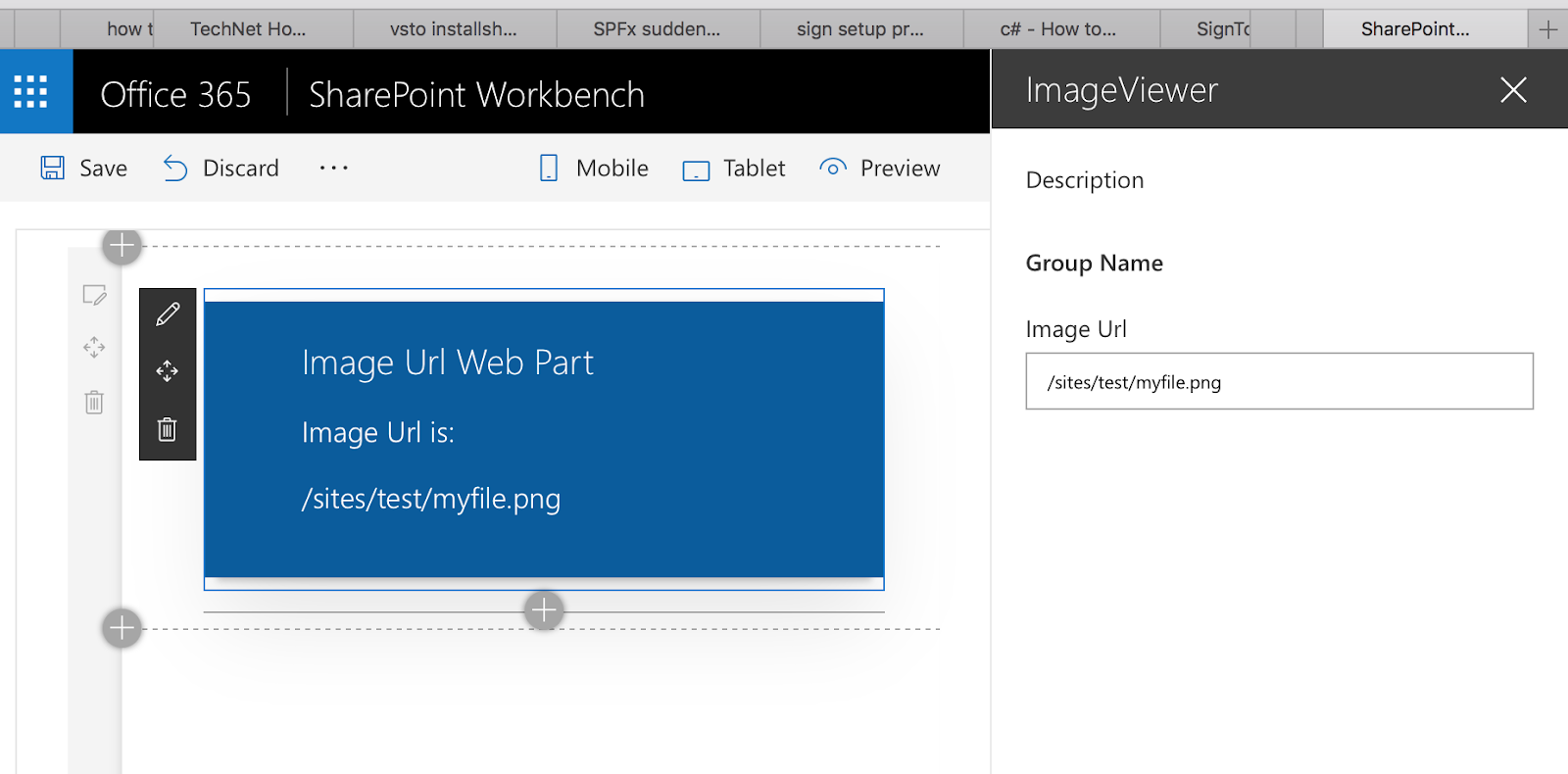
import { PropertyFieldImageUrl } from '../../propertyFields/imageUrl/PropertyFieldImageUrl';PropertyFieldImageUrl('imageUrl', {
key: 'imageUrl',
label: strings.ImageUrlFieldLabel,
value: this.properties.imageUrl,
properties: this.properties,
onPropertyChange: this.onPropertyPaneFieldChanged
})Now the value from the control can be used somewhere in the web part.
The full code for this sample can be found here.
The web part from this demo just shows the value from the control like that:
Yeoman Generator for Property Pane Controls
Similarly to VueSpfx generator, it would be great to have some "add-on" Yeoman generator that creates all the structure for Property Pane Custom Control and provides some sample code.And there is such generator! generator-spfx-proppane-controlYou can install it using
npm i -g generator-spfx-proppane-controlThe generator supports not only Vue.js but React and No Framework options as well.
The documentation can be found here. It's pretty simple but covers main features.
Please, leave your feedback or contribute to the generator!
It's highly appreciated!
And that's it for today!
Have fun!
Comments